
whale
Sandra Qin
Instructor:
Adam Brodowski
2023
Instructor:
Adam Brodowski
2023
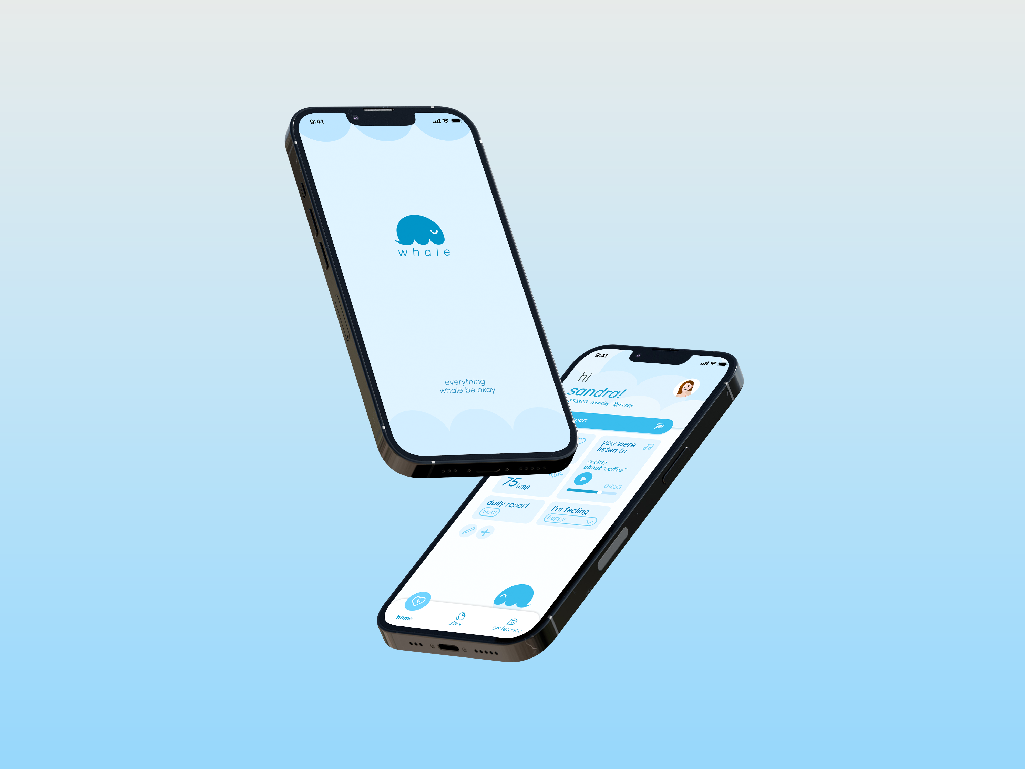
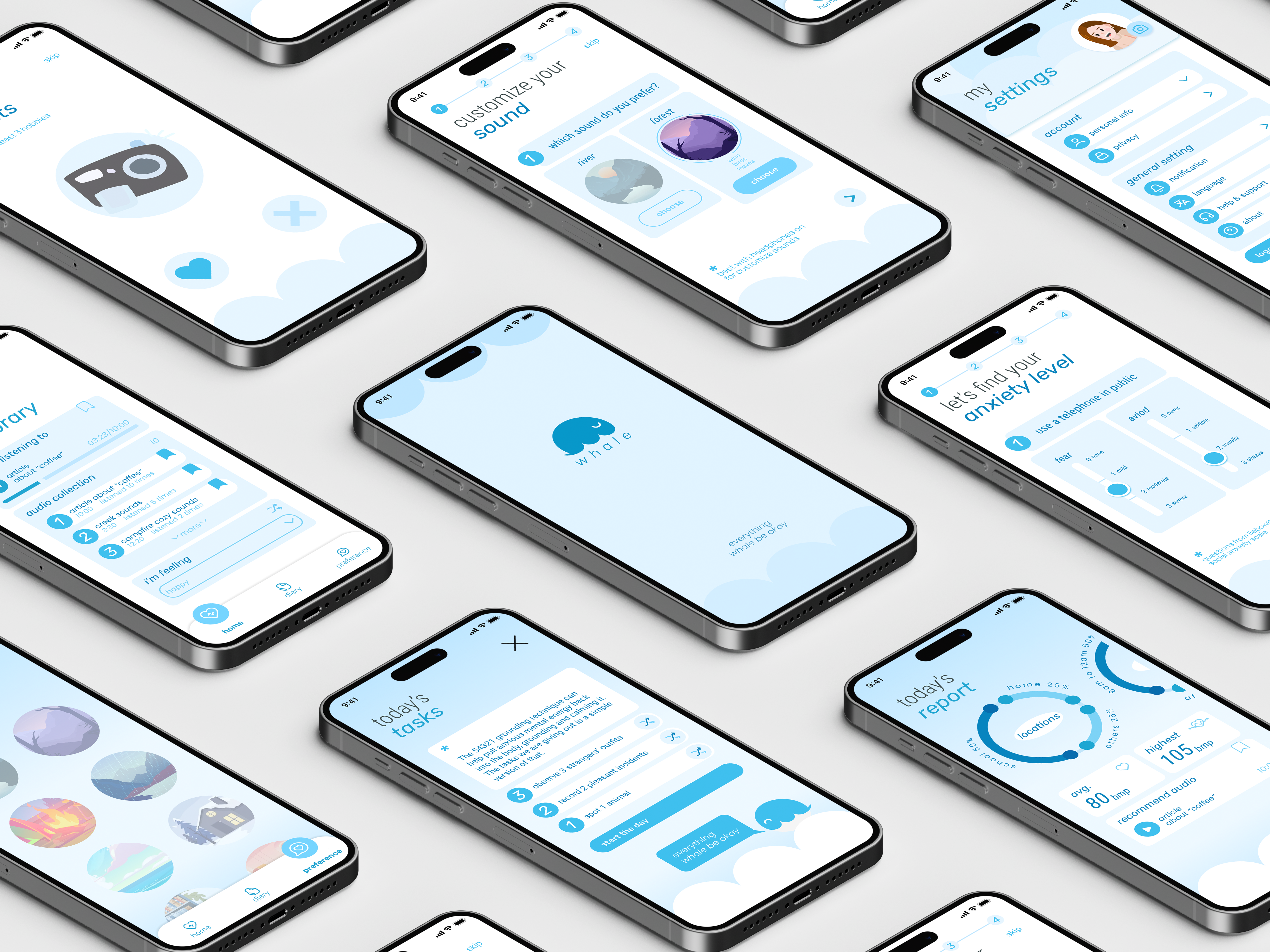
"Whale" is an application designed to alleviate communication apprehension or social anxiety. It will be highly personalized to each individual user, based on their interests and audio preferences.
User Interface / User Research / User Experience
↧Downlaod the static casebook
User Interface / User Research / User Experience
↧Downlaod the static casebook
A.Problem Discovery
Communication apprehension (AKA social anxiety) is a degree or measure of the anxiety triggered by the real or anticipated communication act.
I chose this topic because it troubles me a lot. After my research, I was shocked to learn that many people are actually suffering from social anxiety.
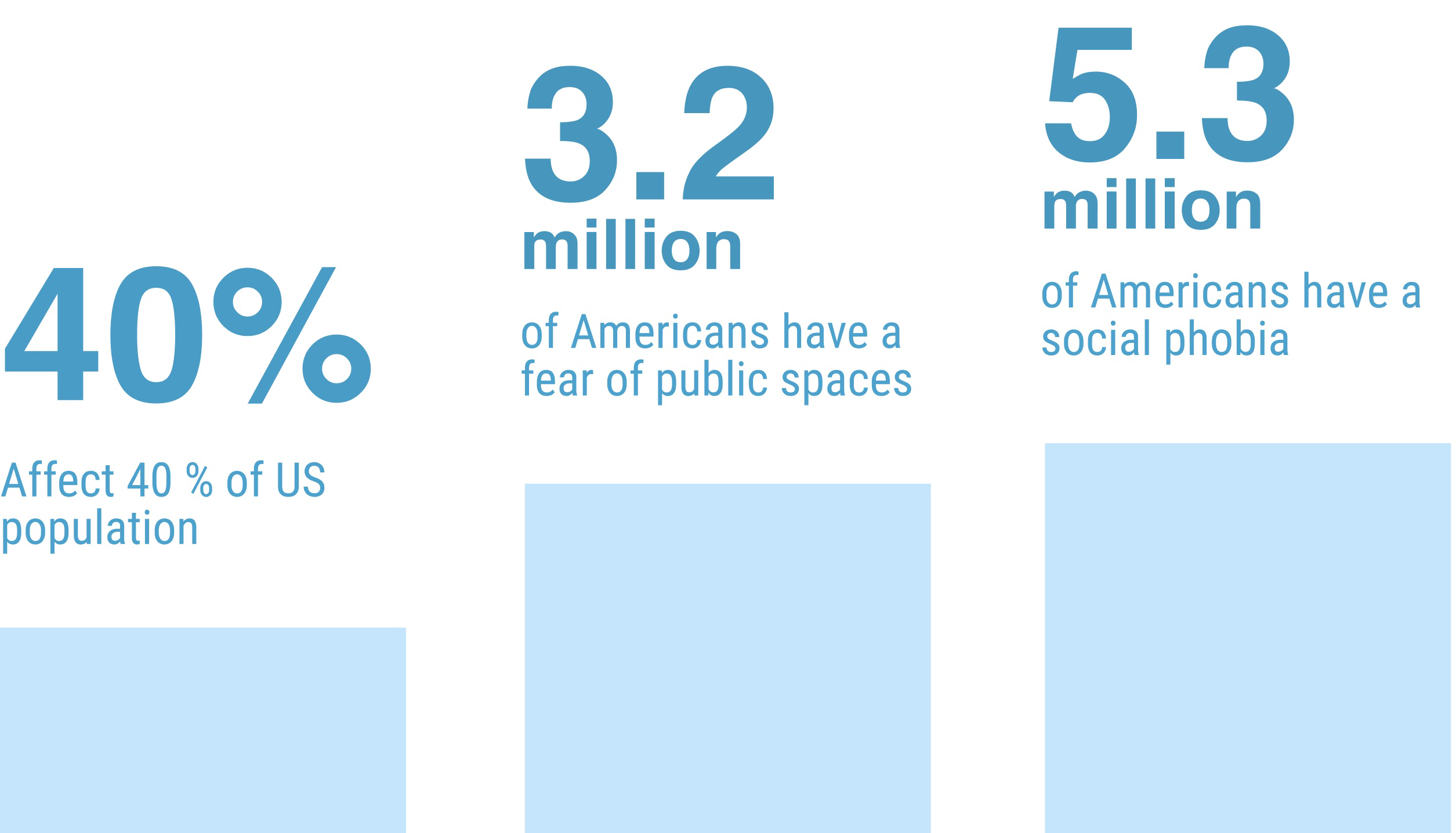
It affects
I chose this topic because it troubles me a lot. After my research, I was shocked to learn that many people are actually suffering from social anxiety.
It affects
- 40% of the US population
- 3.2 million have a fear of public spaces
- 5.3 million have a social phobia

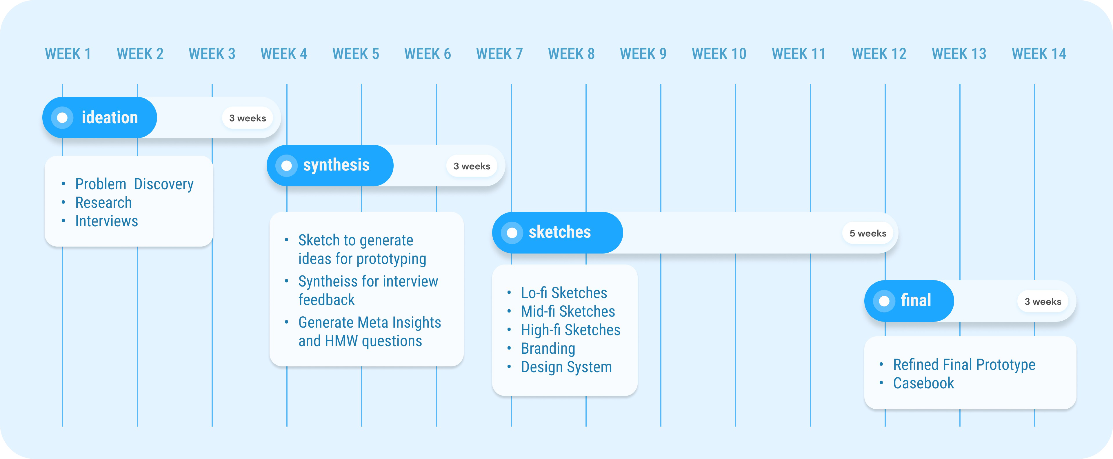
Project Timeline
B.Research
01.Desk Research
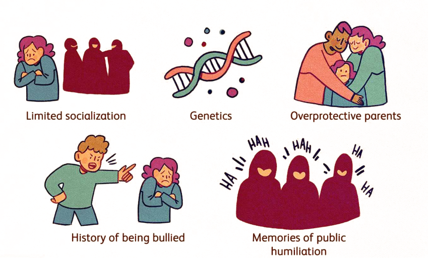
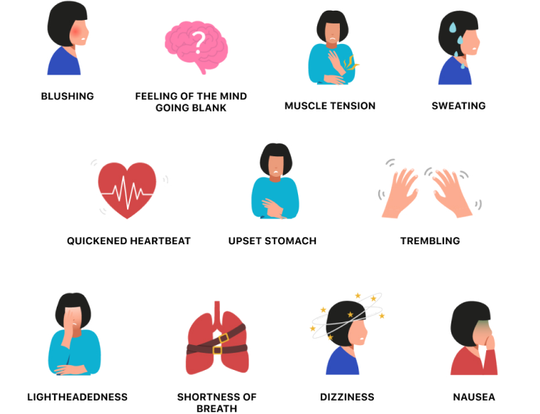
During my desk research, I delved deeply into the potential causes of social anxiety and the various symptoms that people experience. What I found is that the causes and symptoms of social anxiety can vary from person to person.
Therefore, it's crucial to have customized functions that cater to each user's specific preferences. By doing so, the app can provide a personalized solution that can help users manage their social anxiety in their daily life.
Therefore, it's crucial to have customized functions that cater to each user's specific preferences. By doing so, the app can provide a personalized solution that can help users manage their social anxiety in their daily life.
02. Competitive Audit

I conducted a competitive audit analyzing existing anxiety coping apps such as Calm, Headspace, and Youper with the aim of differentiating my product from theirs.
While these apps have a large audio library, they lack personalization and target users in a general way. Therefore, I decided to approach the solution with a more customized experience for each user, based on their individual interests and audio preferences.
While these apps have a large audio library, they lack personalization and target users in a general way. Therefore, I decided to approach the solution with a more customized experience for each user, based on their individual interests and audio preferences.
03. Interviews
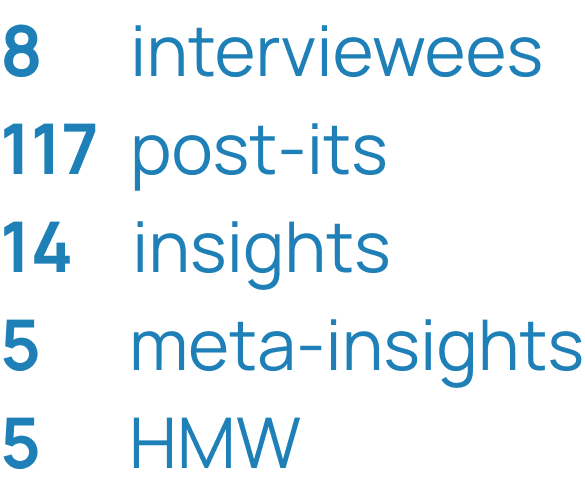
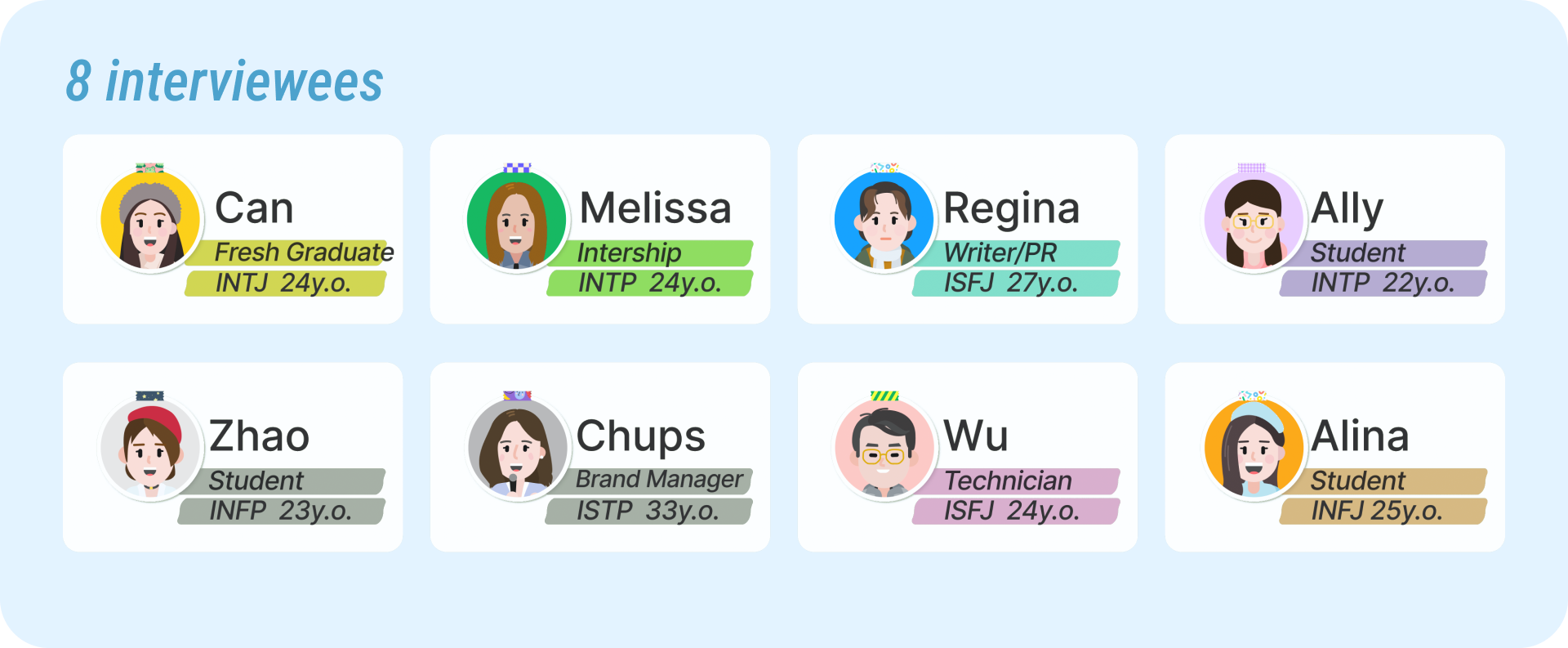
To gain insights into the various causes of anxiety, I conducted interviews with eight individuals and collected over 100 post-it notes. Through this process, I was able to generate 14 insights and 5 meta-insights, which led to the development of 5 HMW (How Might We) questions.
The interviewees were primarily between the ages of 20 to 35, as I wanted to target the potential users of my product. I used the Myers-Briggs Type Indicator (MBTI) to identify interviewees who were introverted, as they are more likely to experience social anxiety.
The interviewees were primarily between the ages of 20 to 35, as I wanted to target the potential users of my product. I used the Myers-Briggs Type Indicator (MBTI) to identify interviewees who were introverted, as they are more likely to experience social anxiety.
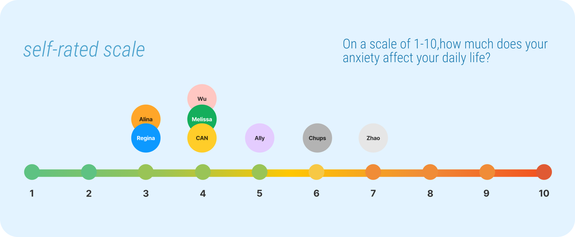
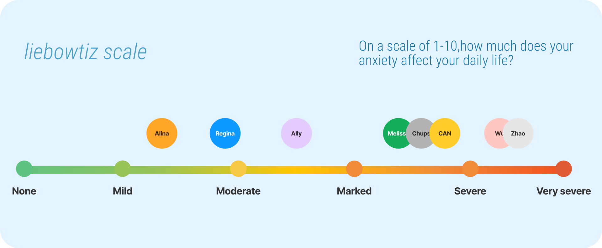
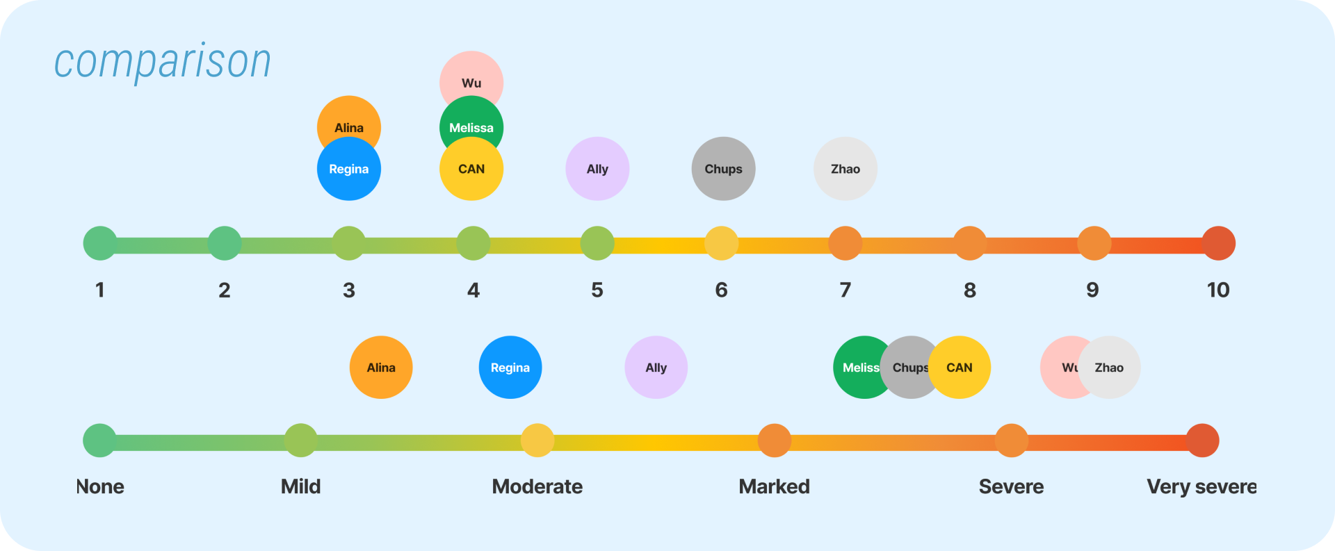
During the interviews, I asked the participants to complete two anxiety quizzes. At the beginning of the interview, they self-assessed their social anxiety level. Then, 30 minutes into the interview, they took the Liebowitz Anxiety Scale.
The results varied greatly among the participants, highlighting the fact that many people may not be aware of their mental condition without the use of a professional scaling system. This information may also be a crucial element in developing my product.
The results varied greatly among the participants, highlighting the fact that many people may not be aware of their mental condition without the use of a professional scaling system. This information may also be a crucial element in developing my product.
04. Synthesis
After conducting the interviews, I analyzed the gathered data and identified five meta-insights.
Getting attention
causes anxiety.
How might we avoid/alleviate
anxiety from others attention?


Uncertainty
causes anxiety.
How might we prepare better for making decisions?


Subconscious behaviors during anxiety can be relaxing.
How might we find substitution for harmful behavior?


Most of the people choose
temporary distraction.
How might we infiltrate the solution into their daily life?


Some people choose to find the solution for the origin of anxiety.
How might we provide beforehand or afterwards solution?


C.Sketches
01.Low-Fidelity Sketches
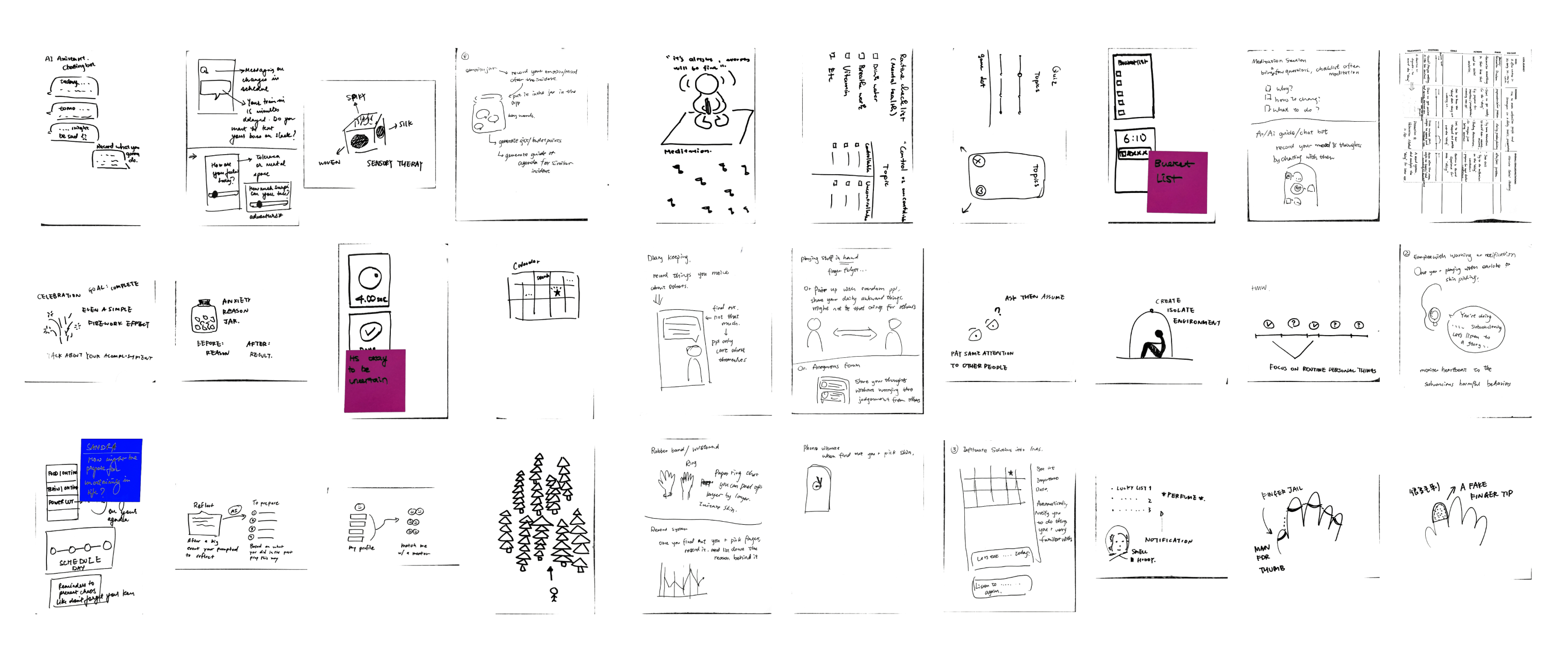
After synthesizing my findings, I moved on to creating sketches, which included ideas from both my classmates and myself.
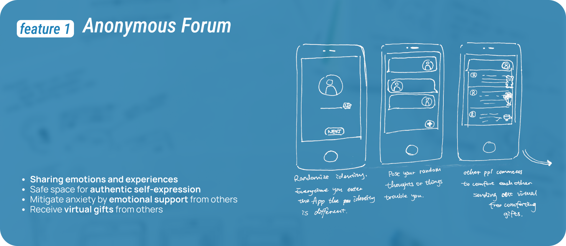
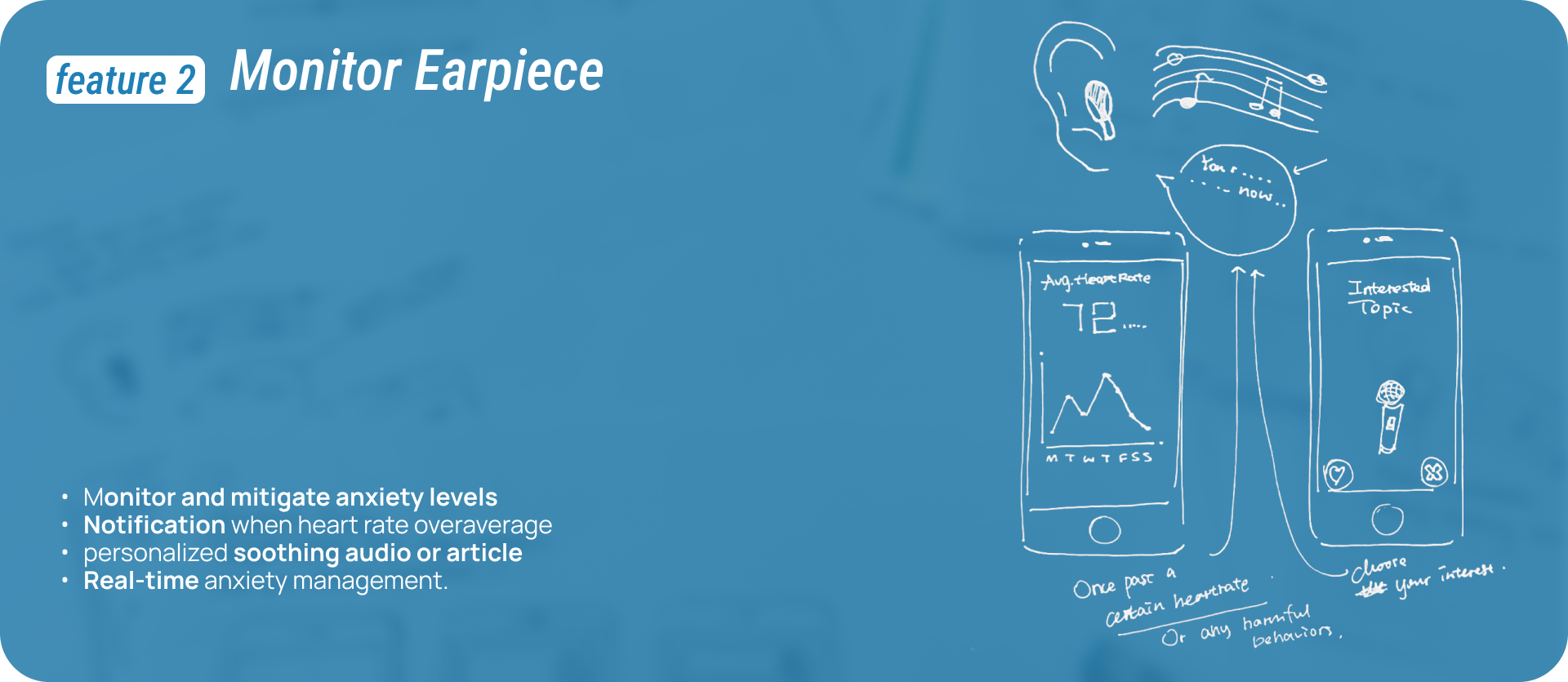

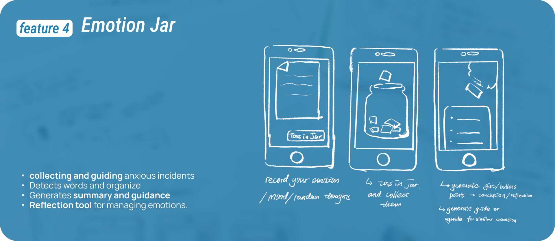
02.Mid-Fidelity Sketches
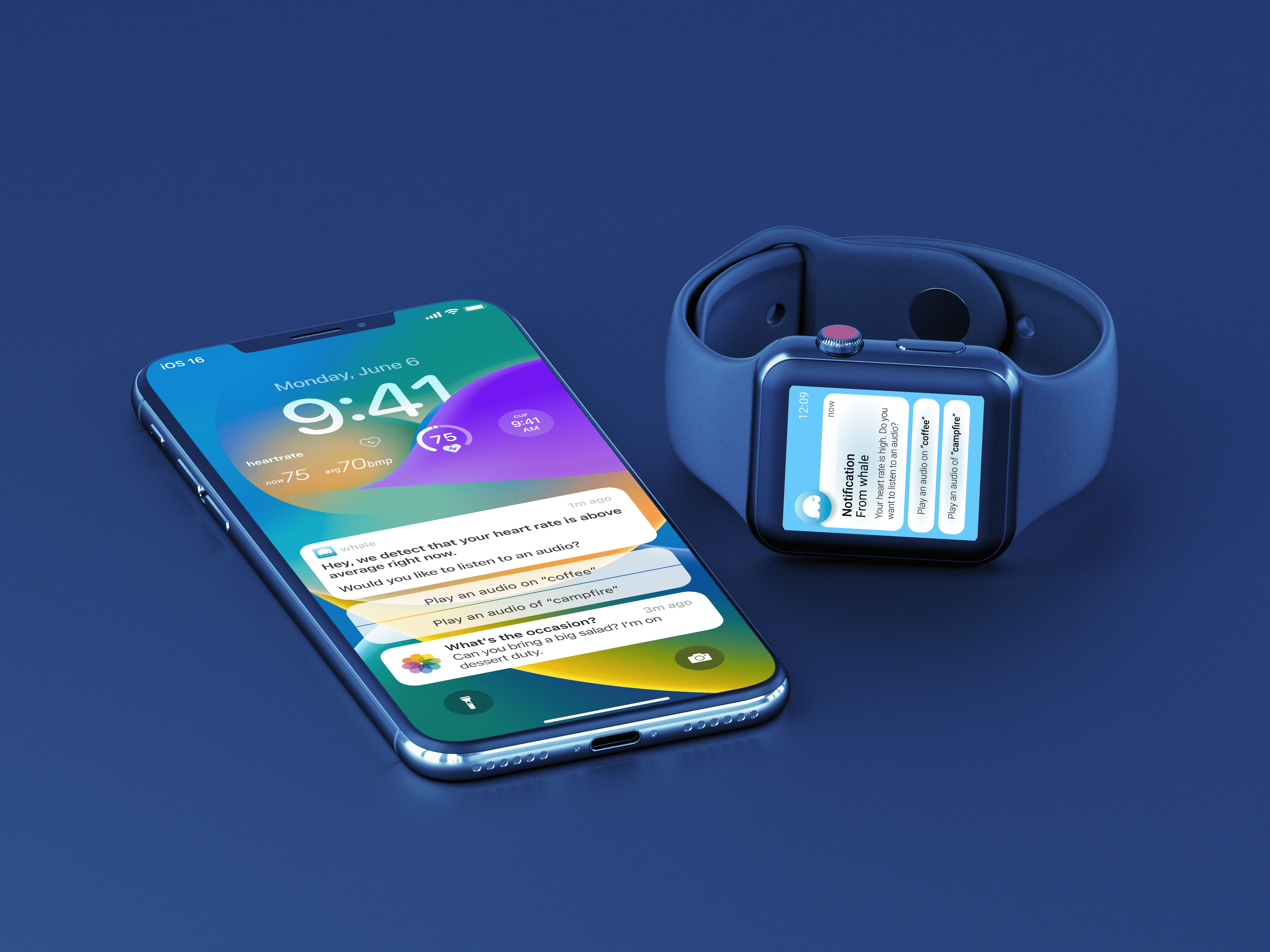
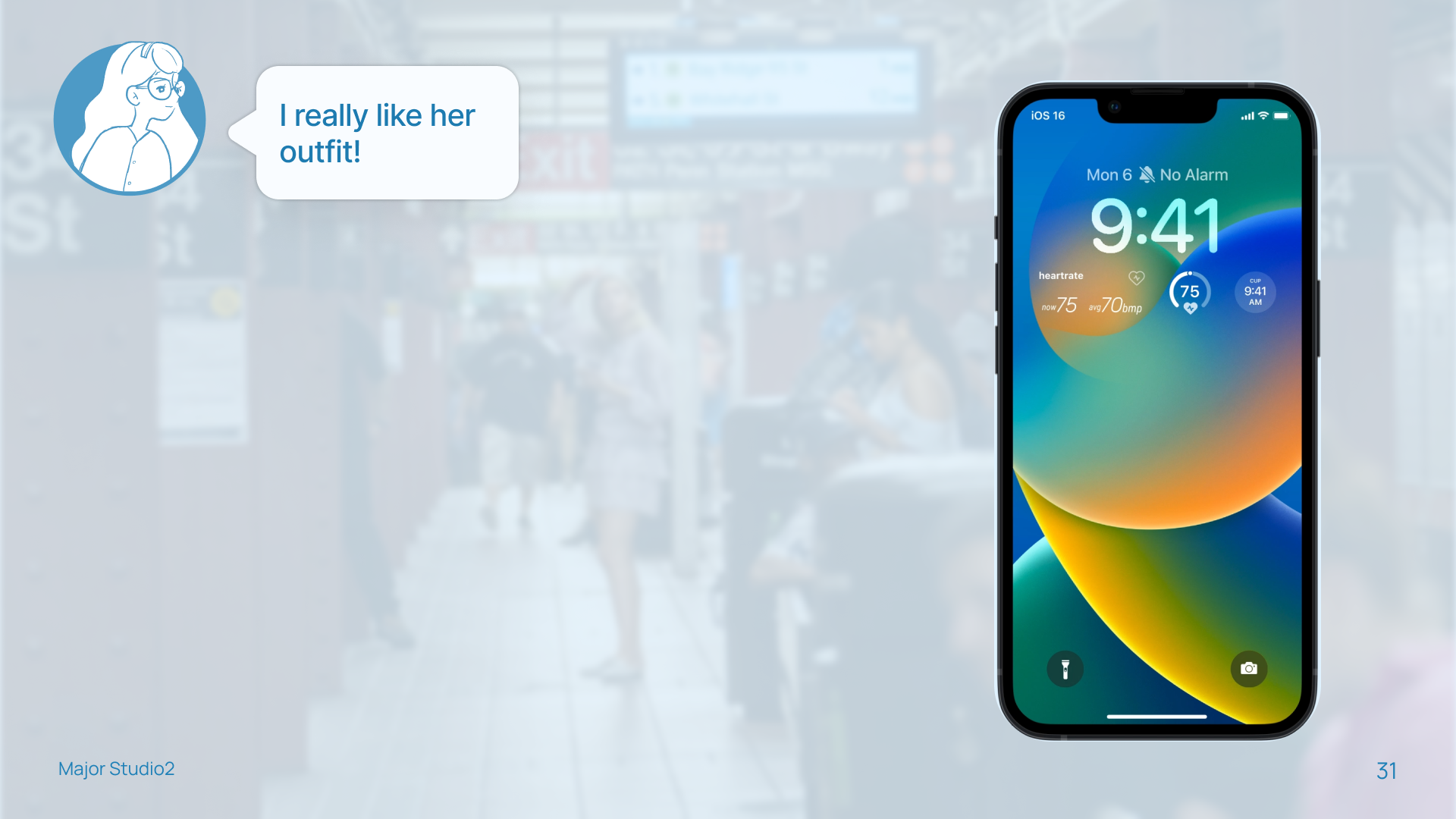
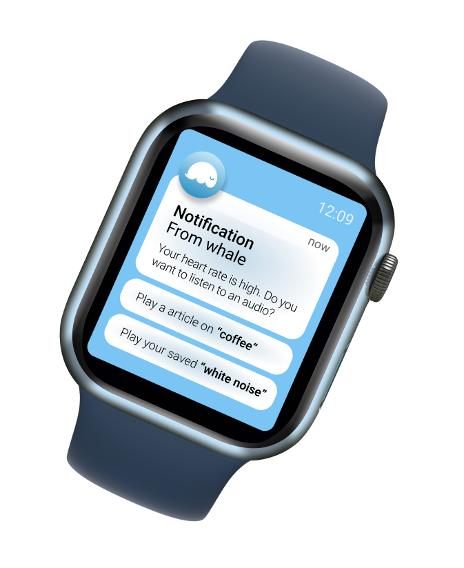
For the mid-fi prototype, I decided to combine the earpiece and task assigning features. I chose to utilize the Apple product suite because the heart rate can be monitored with the Apple Watch and music can be played through AirPods.

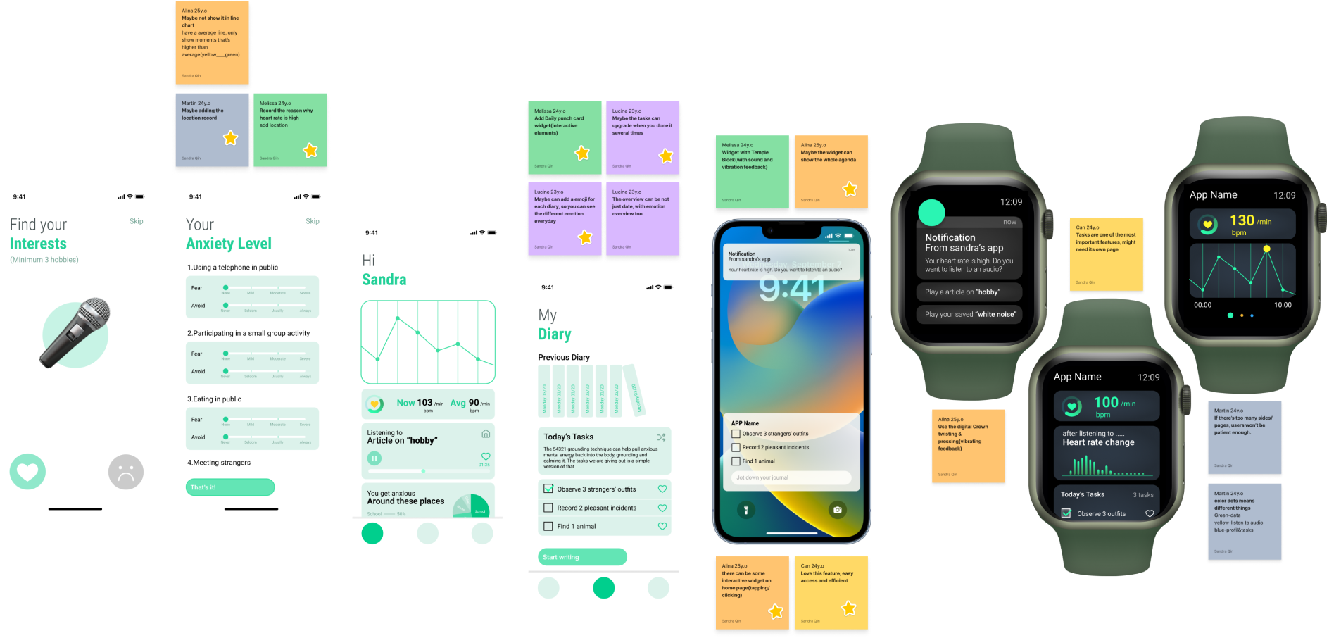
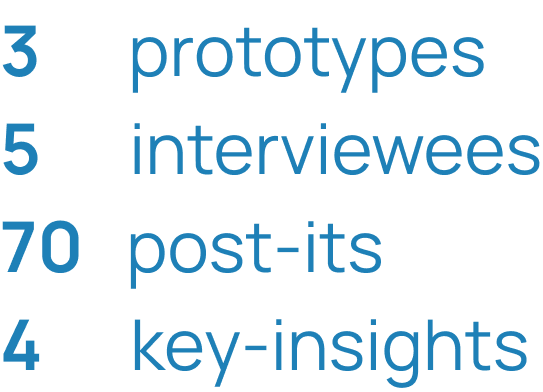
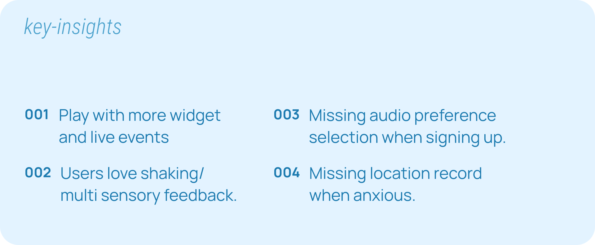
During this stage, I created three prototypes, which were user-tested with five interviewees. I collected 70 post-it notes and ultimately derived four key insights.
D.Hi-Fidelity Prototype
01.Go through the story
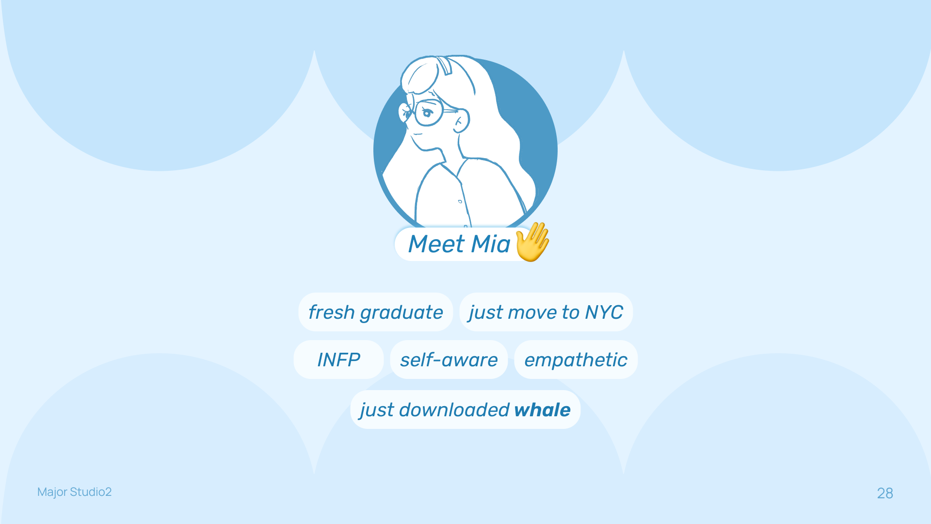
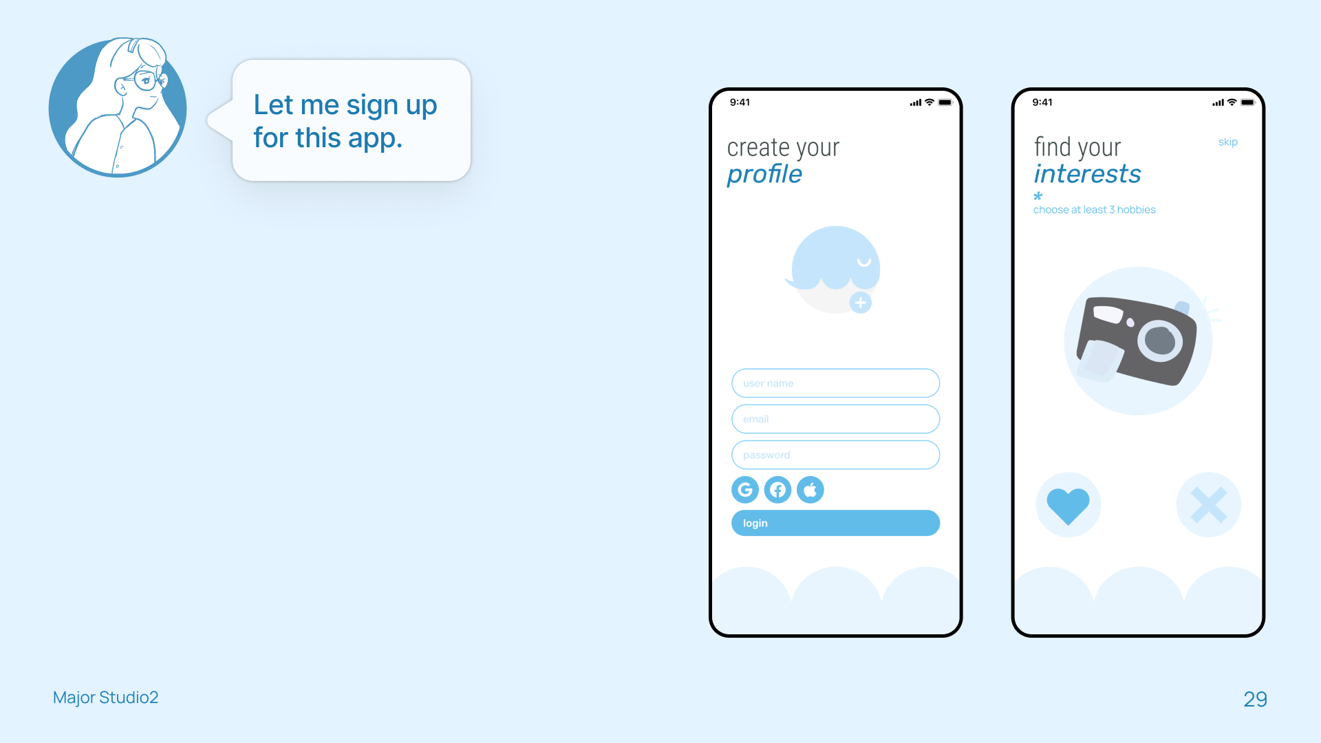
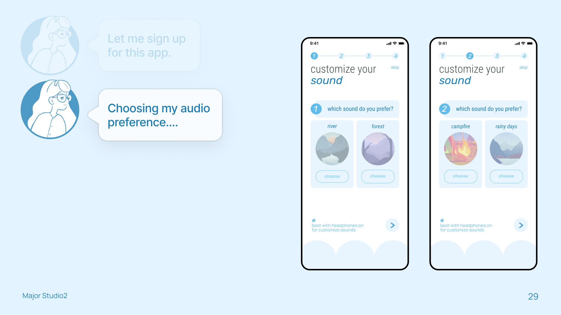
Join Mia on her journey of discovering the Whale app. Follow along as she explores the app's features and learns how it can support her in managing her emotion, and help with her social anxiety.
After downloading the app


On her way to work
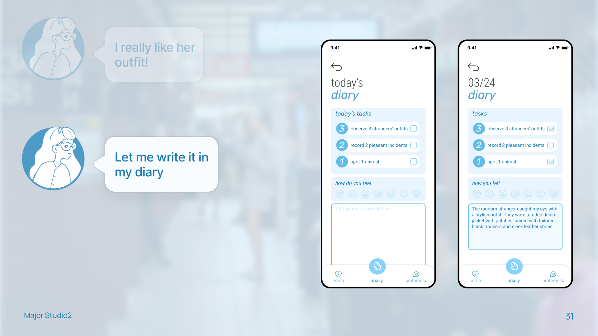

Meeting her co-workers in 10 mins

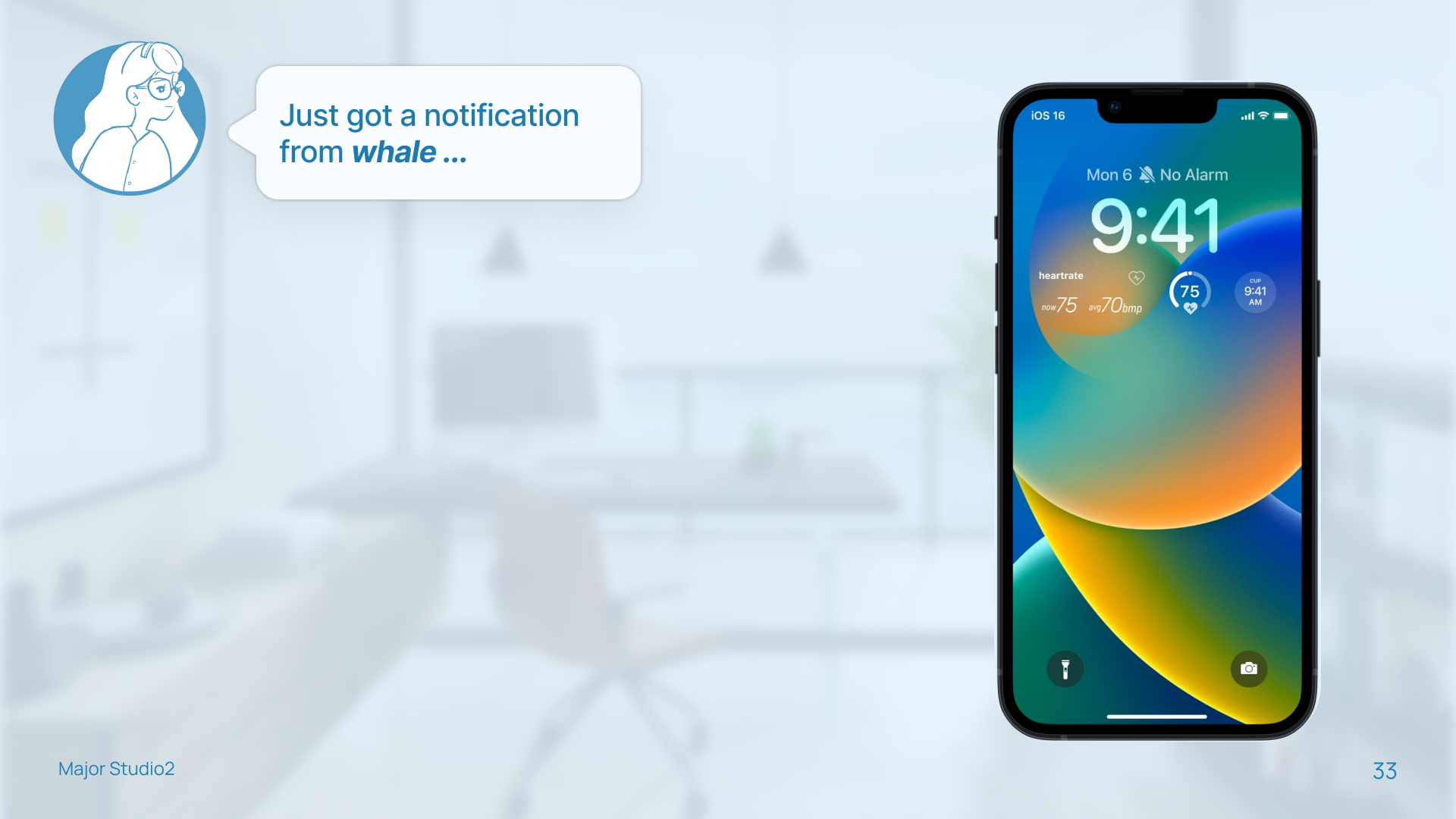


02.Explore the interactive prototype
03.Design System
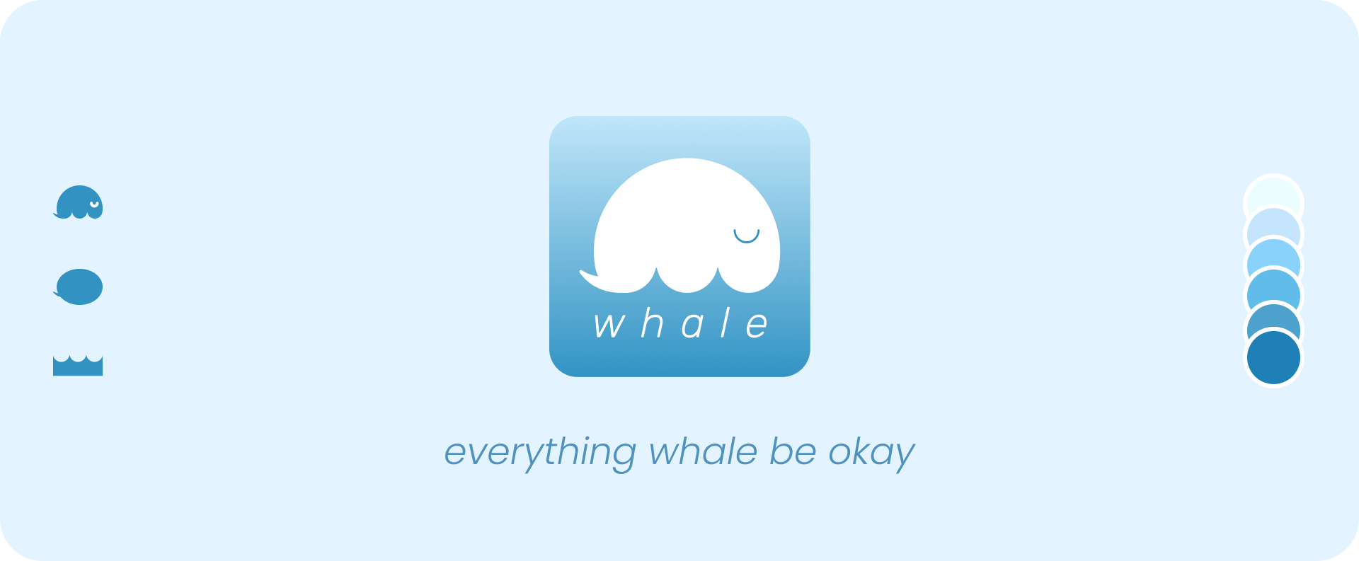
The inspiration for the logo came from the combination of text bubbles and ocean waves, resulting in the whale icon.
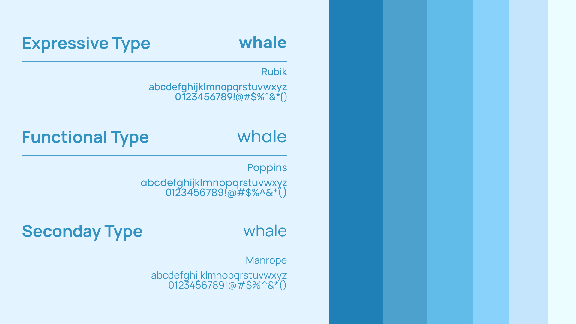
To create a calming vibe for the app, I opted for an all sans-serif, lowercase font. I also used a blue color palette that matched the ocean and whale theme.
To create a calming vibe for the app, I opted for an all sans-serif, lowercase font. I also used a blue color palette that matched the ocean and whale theme.

E.Next Steps
Refine and discover more about the apple watch design.
Organize my components if there’s more time.
Conduct one more round of user testing after the hi-fi prototype.
Play with live events more.
Back to Top