Tutor Orial

Sandra Qin
Instructor:
Clara Bunker
2022
Instructor:
Clara Bunker
2022
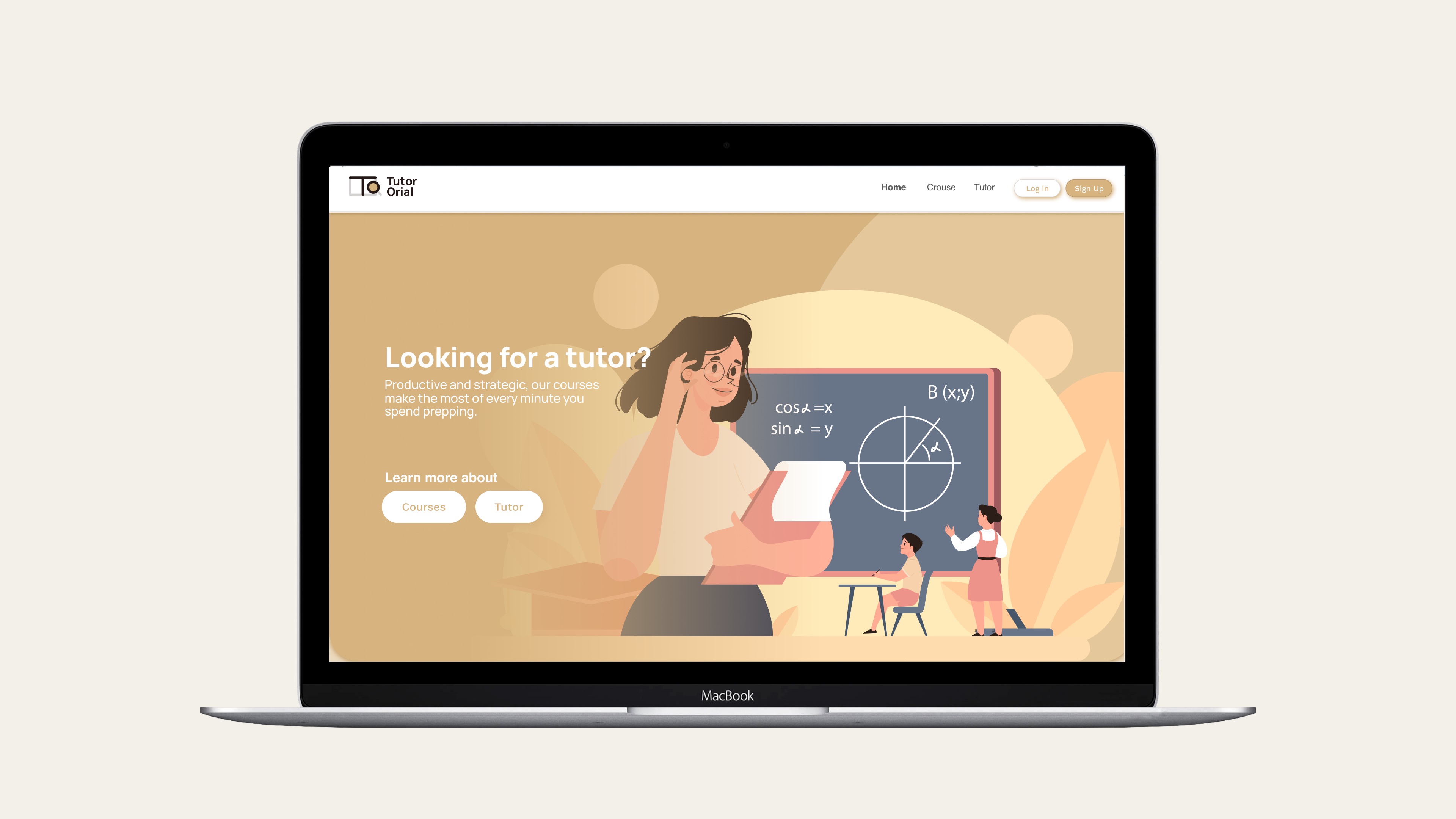
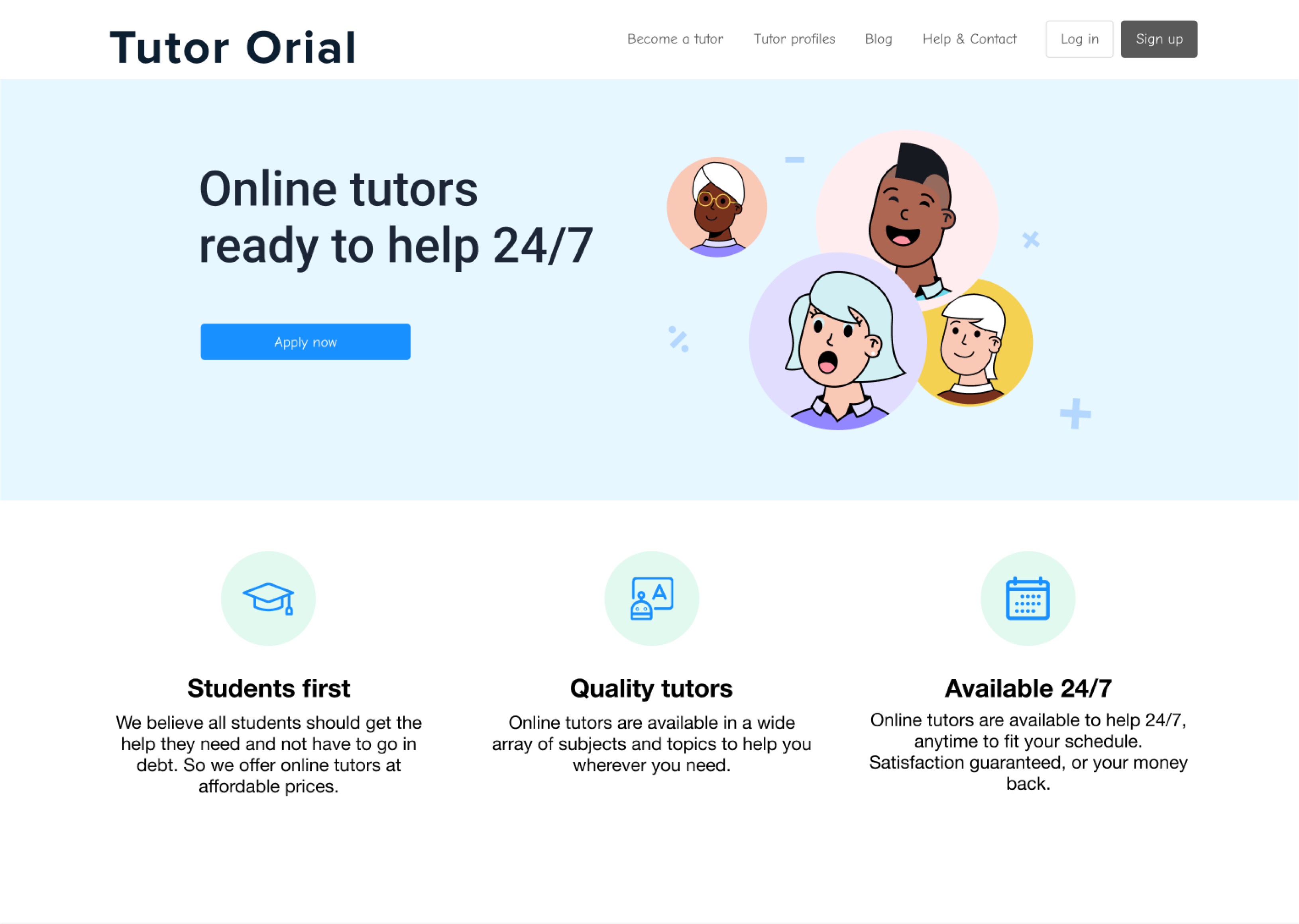
Tutor Orial is a online tutor platform mainly focusing on young students under university by adopting the clean and approachable aesthetic.
User Interface / User Research / User Experience
User Interface / User Research / User Experience
A.Problem Discovery
The first step is problems discovering, I went through the original website, since it’s my first time doing this, I just tried to find out what irritates me intuitively, and analyze the reason why it doesn’t make sense to me.
- Unclear Brandin
- Lengthy forms, Unnecessary questions
01.Usability Heuristics
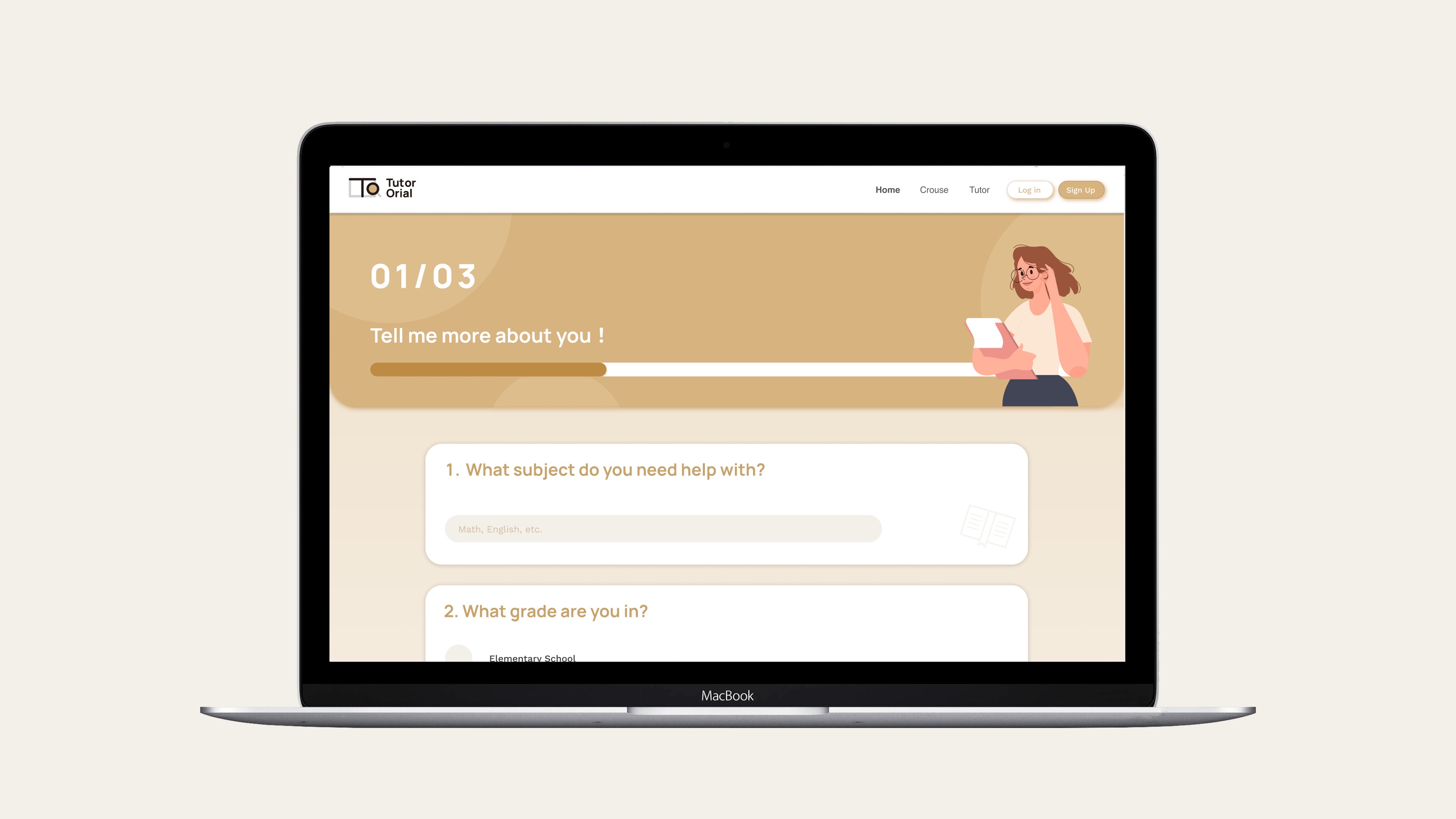
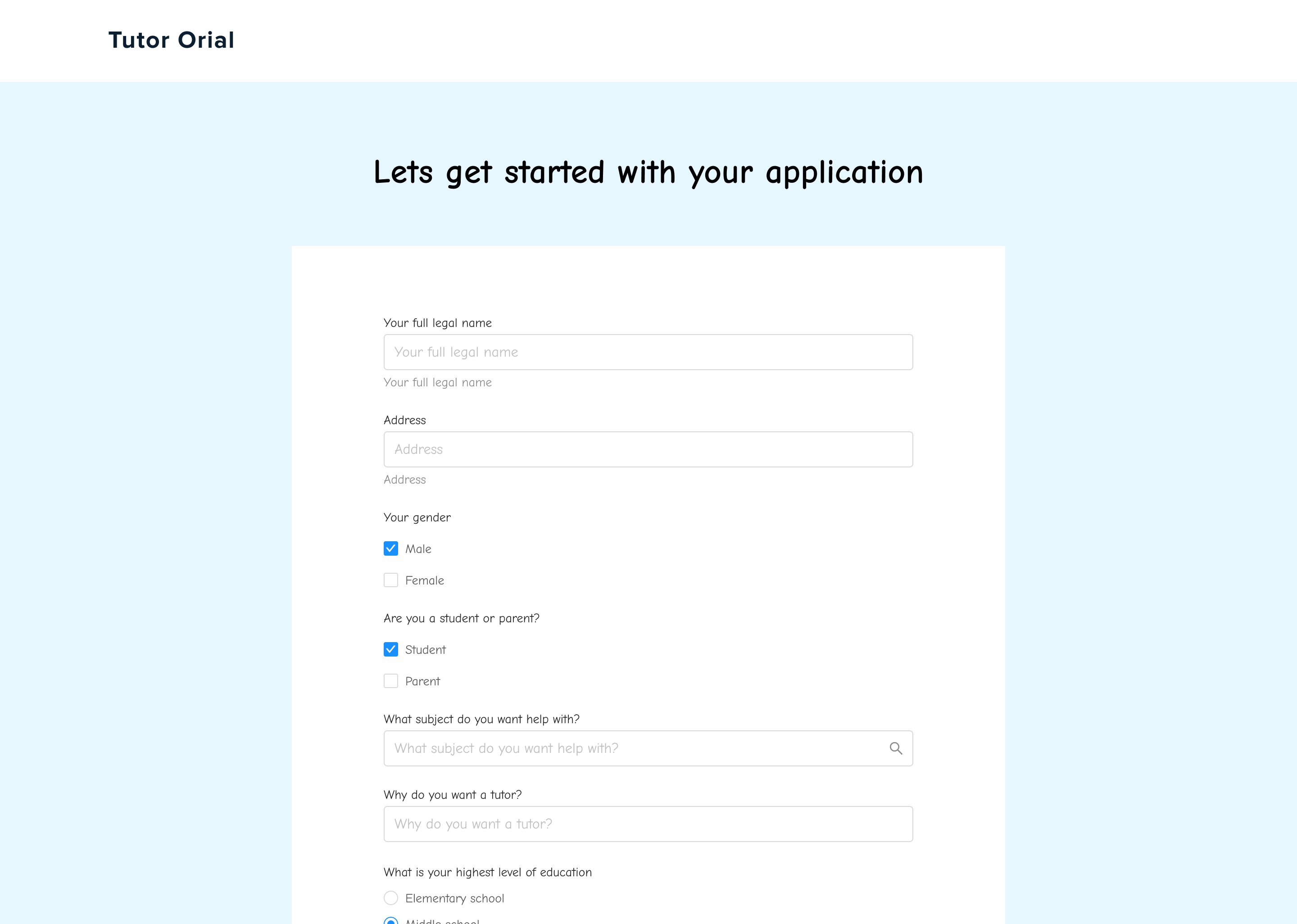
I listed the problems I found and graded them following the Jakob’s 10 Usability Heuristics. There are some minor problems like the typo, some inconsistent buttons, but the two major problems I discover is the unclear branding and the lengthy forms which keep users away.

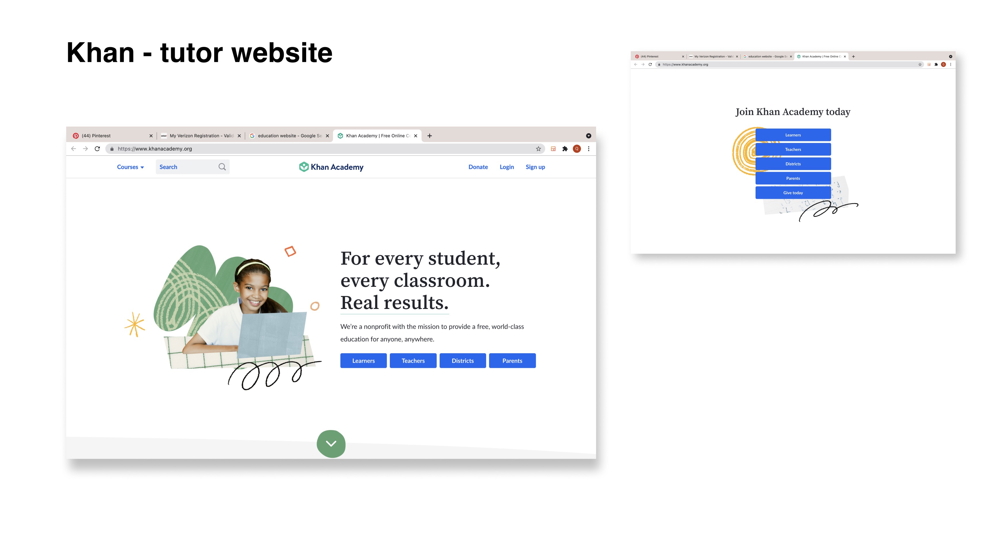
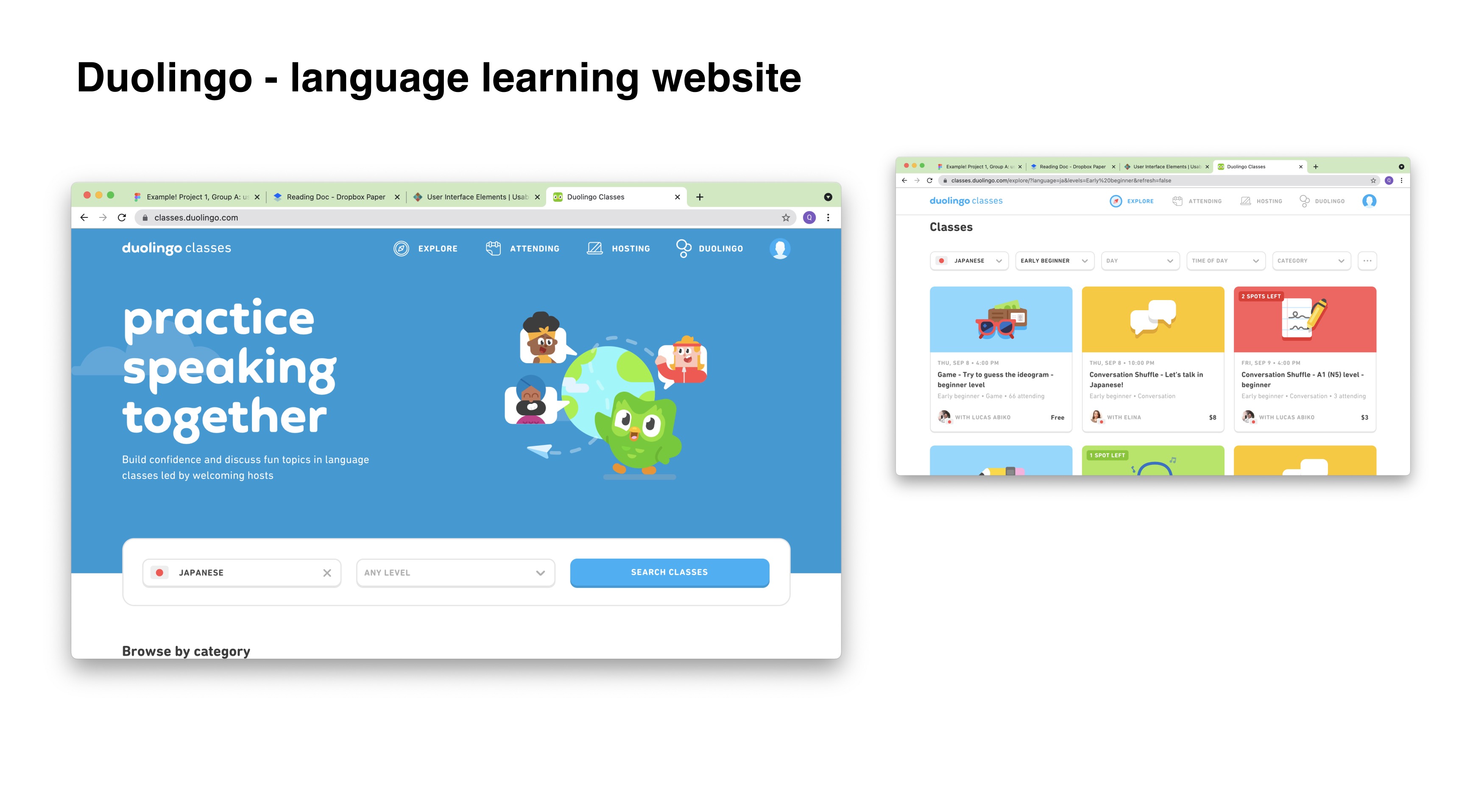
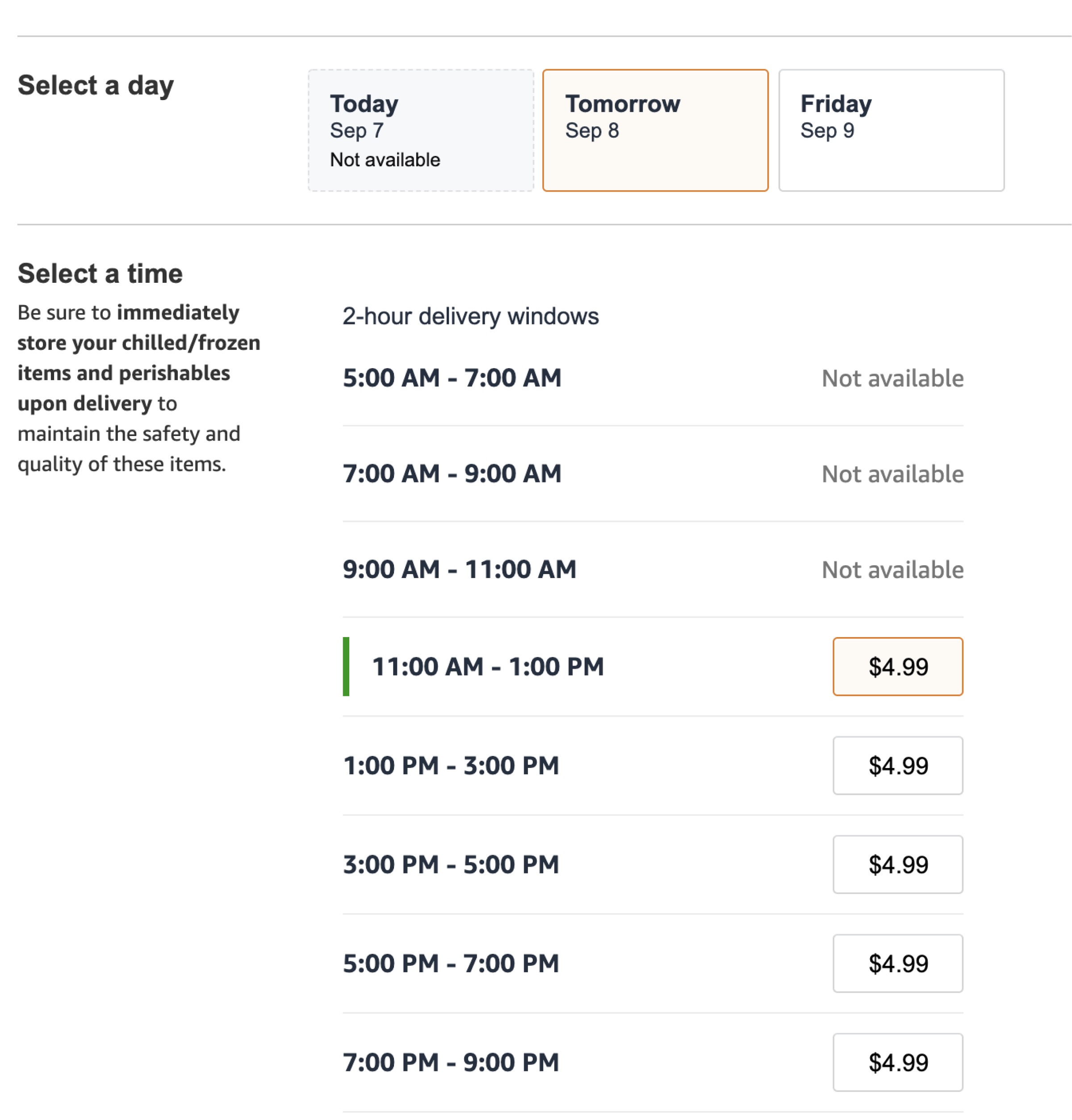
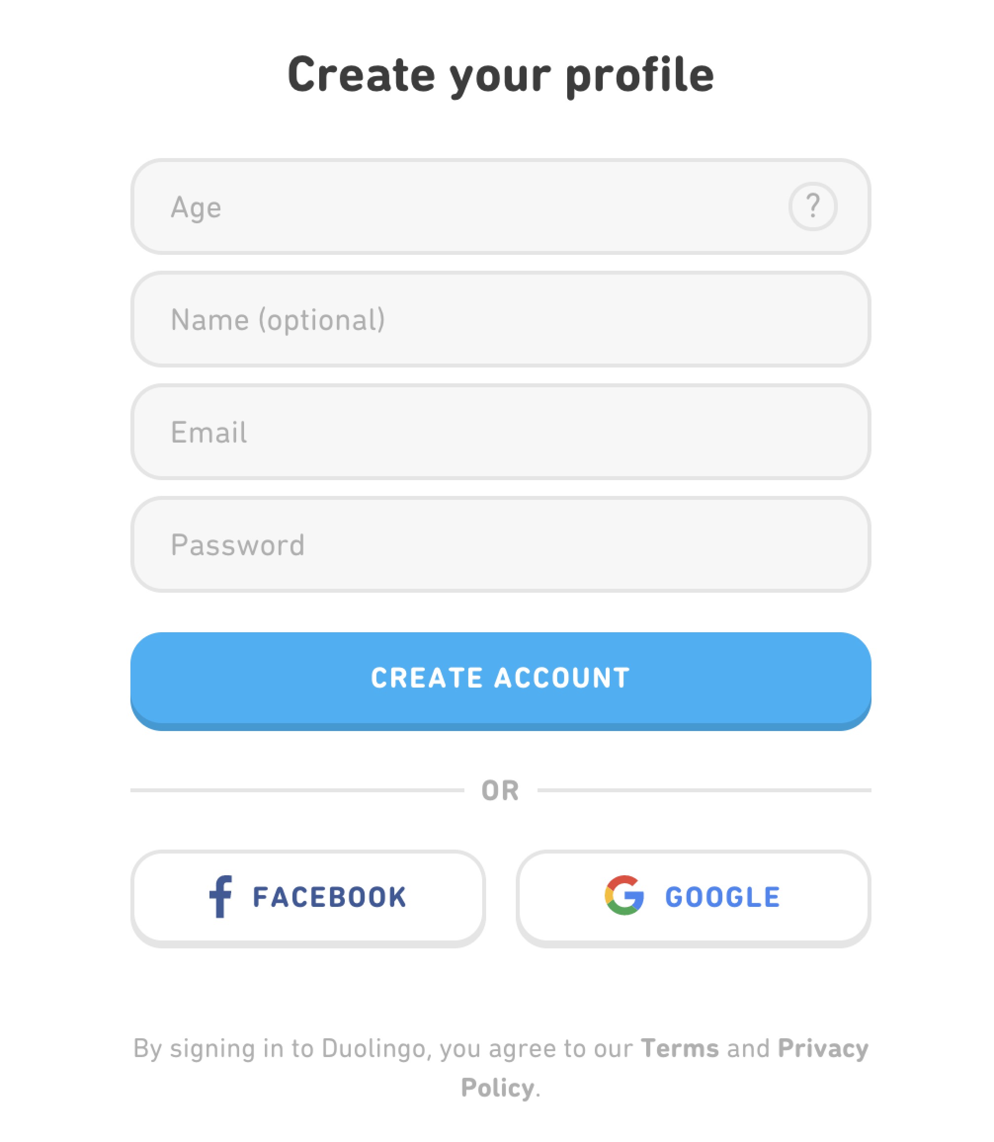
02. Adjacent industry audit
After finding these two major problems, I started to look into adjacent industry to get more idea of what are others in the industry doing. The two main websites I chose is duolingo and khan, both of them embrace their brand identity and visual style very well.
*Element referenceces:


B.Design & Ideation
01.Hypothesis
It is better to have the process detailed and specific,
the application form need to shorten and well sorted to reduce the bounce rate.
cute&friendly aesthetic to clarify brand identity
Based on my graphic background, I started to focus on the unclear branding of this website and try to provide a solution using visual design.
I want to user to
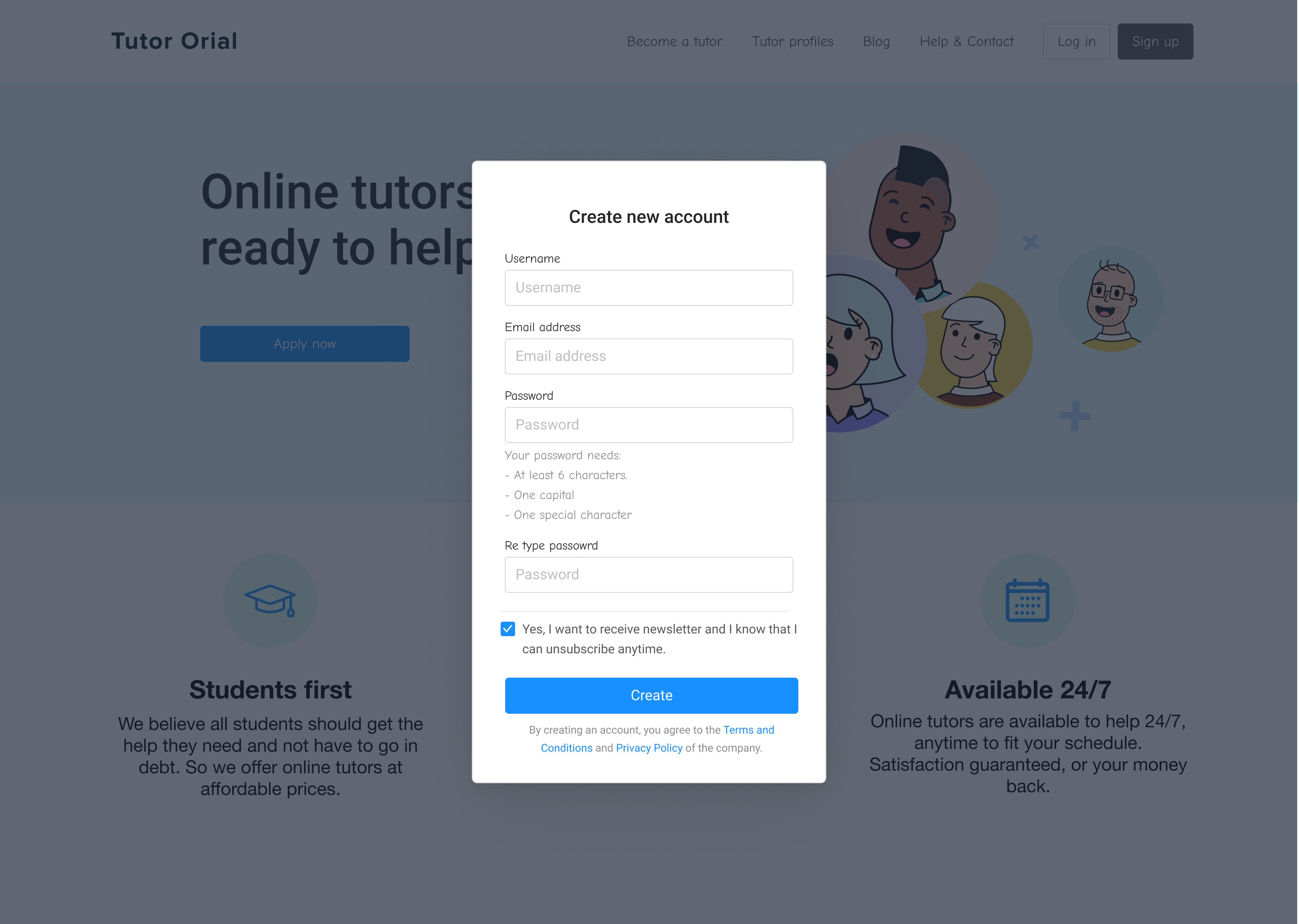
first create account
→ choose tutor
→ pick time
→ payment
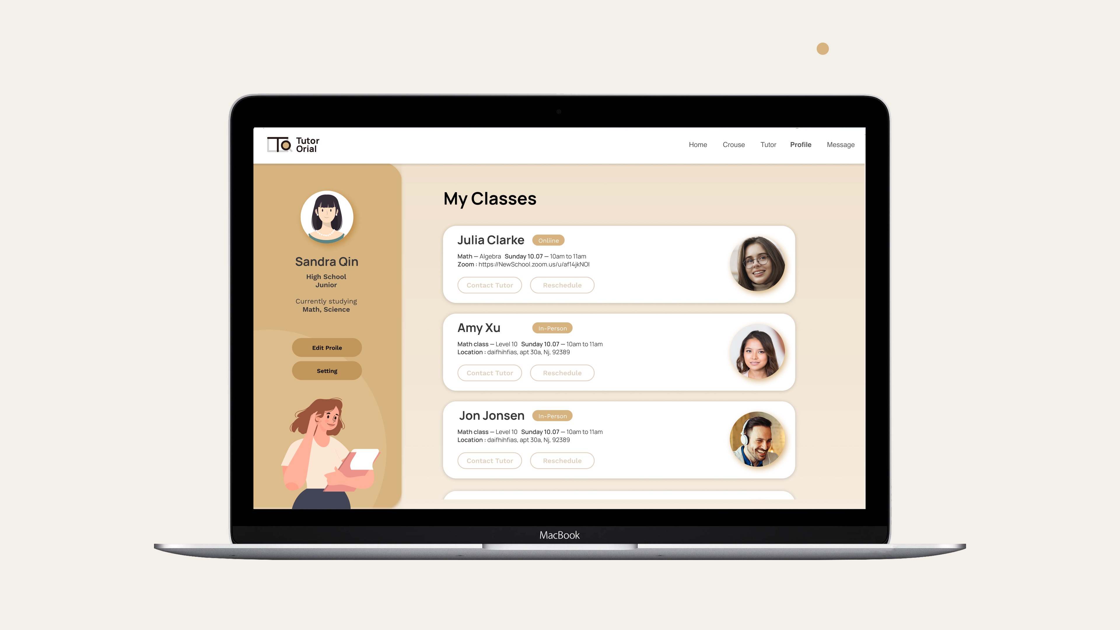
→ confirmation
→ they have access to their profile.
I want to user to
first create account
→ choose tutor
→ pick time
→ payment
→ confirmation
→ they have access to their profile.

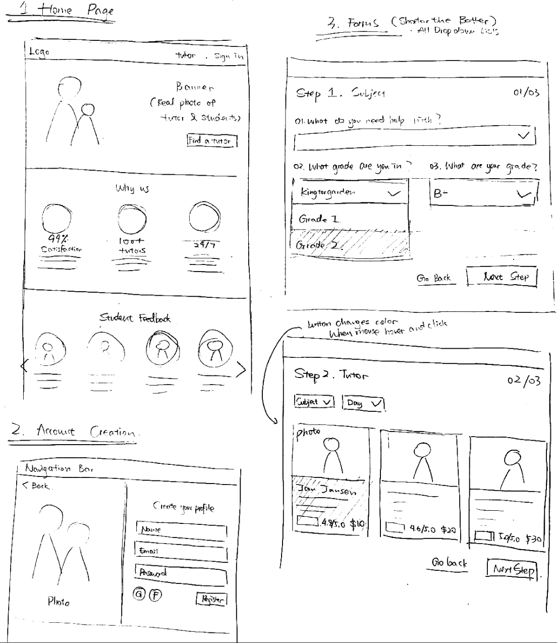
02.Low-Fidelity Sketches
I make the form detailed but concise to solve the bounce rate and set the brand identity cute and friendly.
For example, have a cat / a character as a mascot to go through the steps with the users.
For example, have a cat / a character as a mascot to go through the steps with the users.

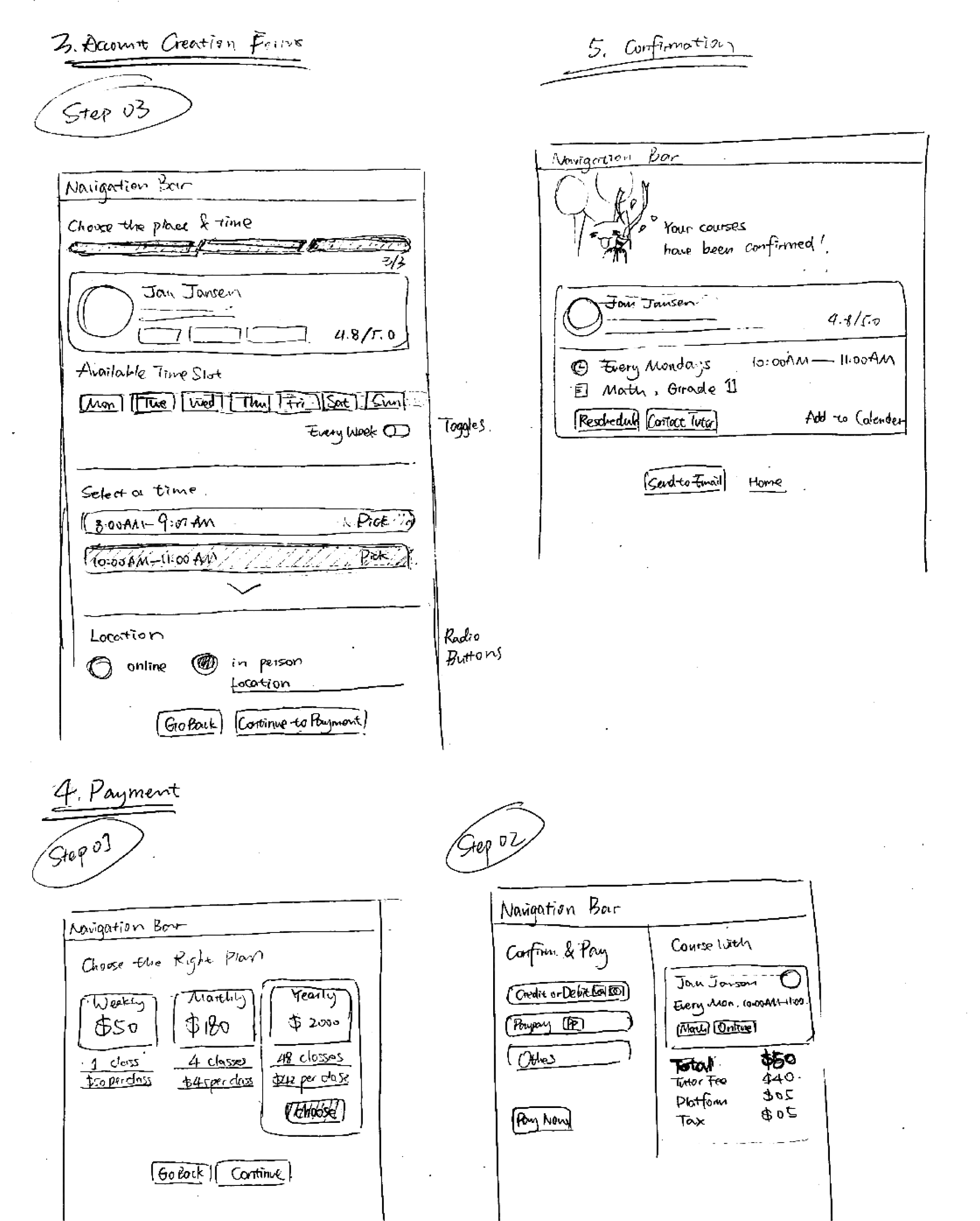
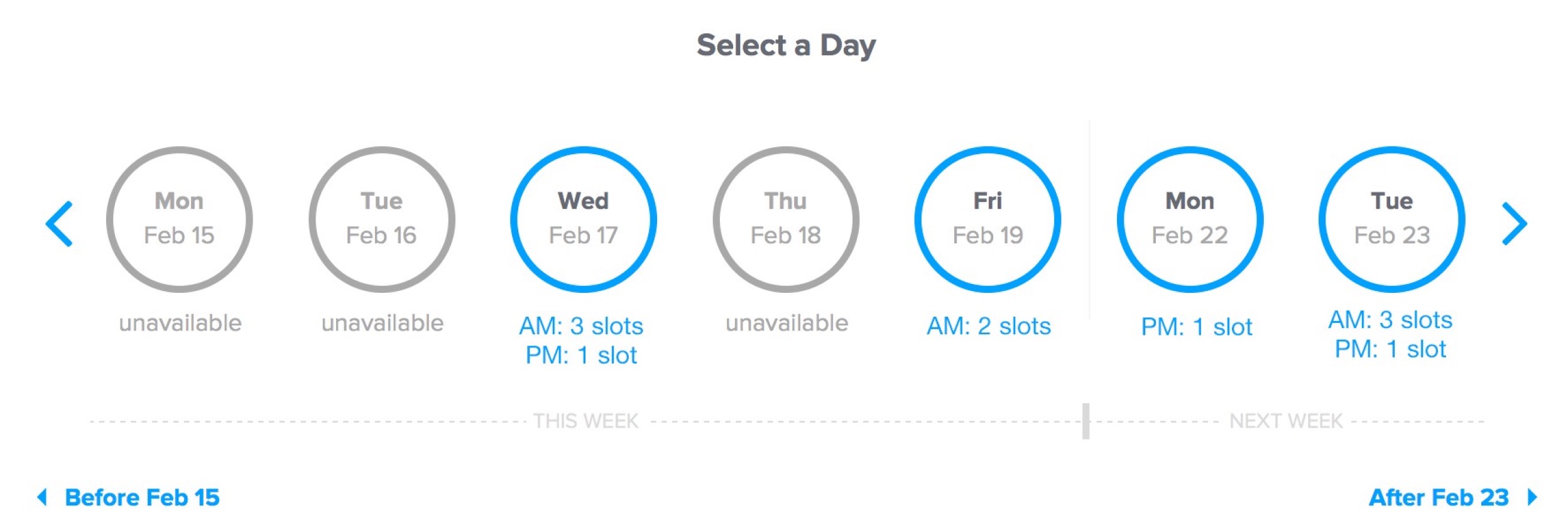
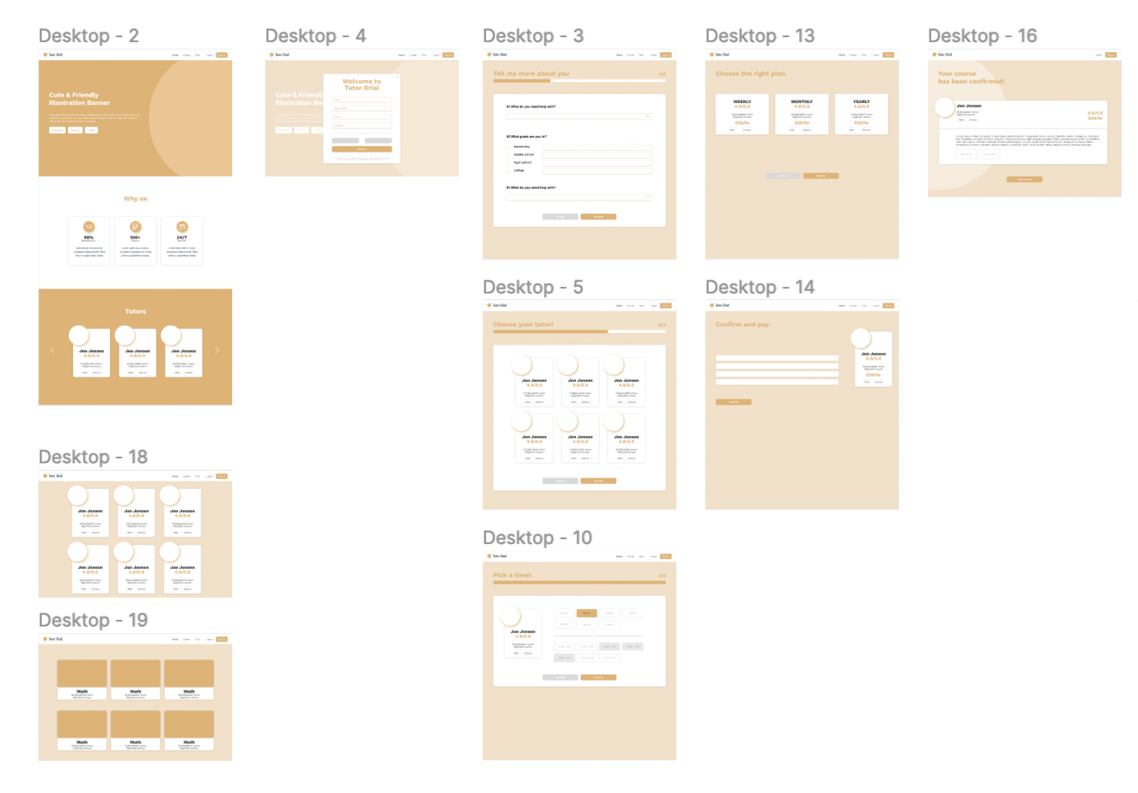
03.Mid-Fidelity Sketches
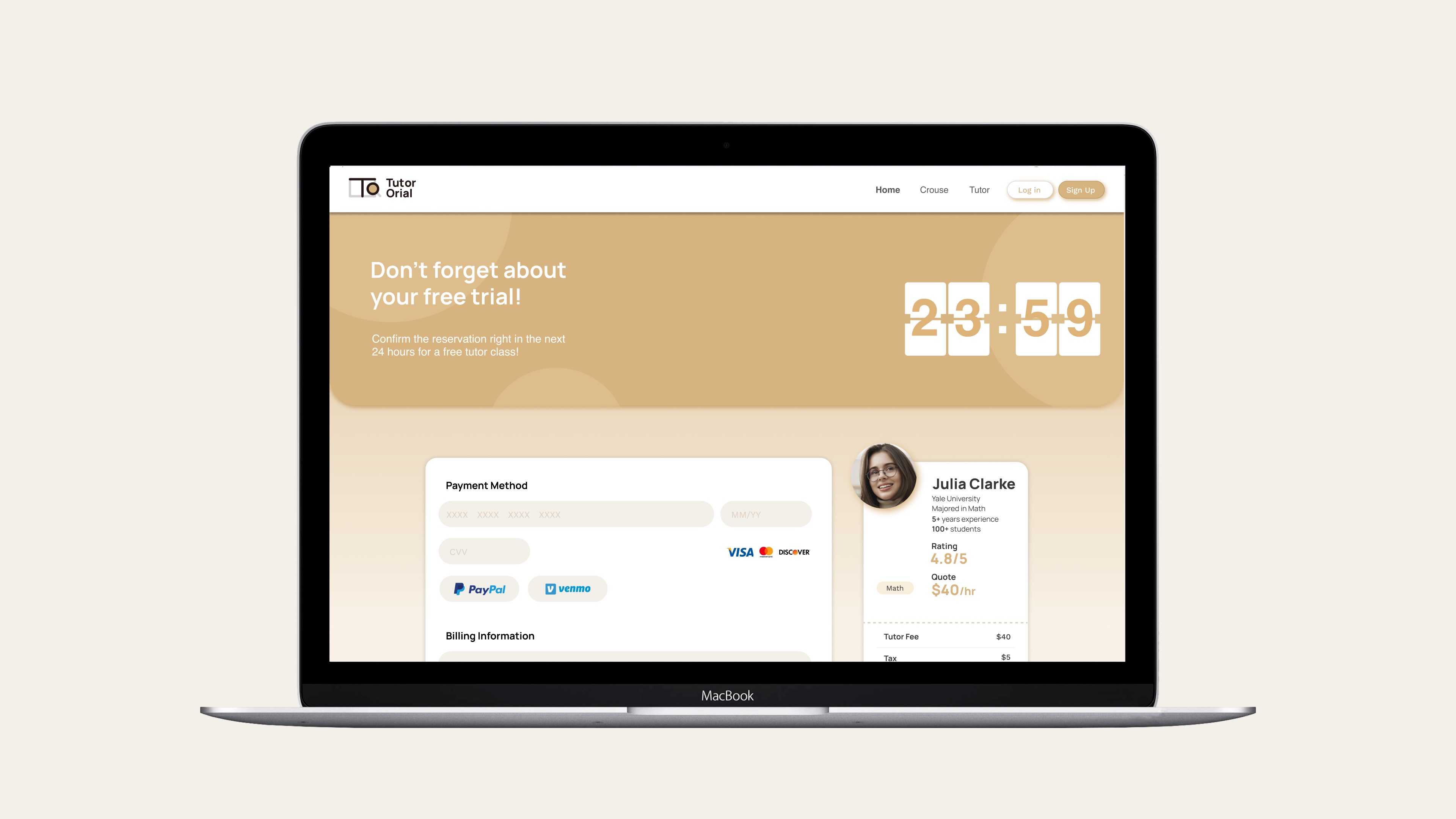
I incorporate this golden color because it usually symbolizes success and achievement, which is what users want to get from a tutor website, and I have all the button and elements rounded and mellow to be more approachable.

*Second Hypothesis
I want it to be more direct and simple to reduce the bounce rate, users directly book tutor on the info page and doesn’t have to create an account. And the branding style will be simple and linear to create a professional mood.


C.User Testing
01.Interview
Through the usability tests, I learned what the target users really want, and what directions they prefer.
I interviewed four people in total, they are people around 20 and 30 who used to work as a tutor before or have experience with a tutor in the past, it definitely helped me to know more about what users focus more on when they are choosing their own tutors.
I interviewed four people in total, they are people around 20 and 30 who used to work as a tutor before or have experience with a tutor in the past, it definitely helped me to know more about what users focus more on when they are choosing their own tutors.


02.Synthesis
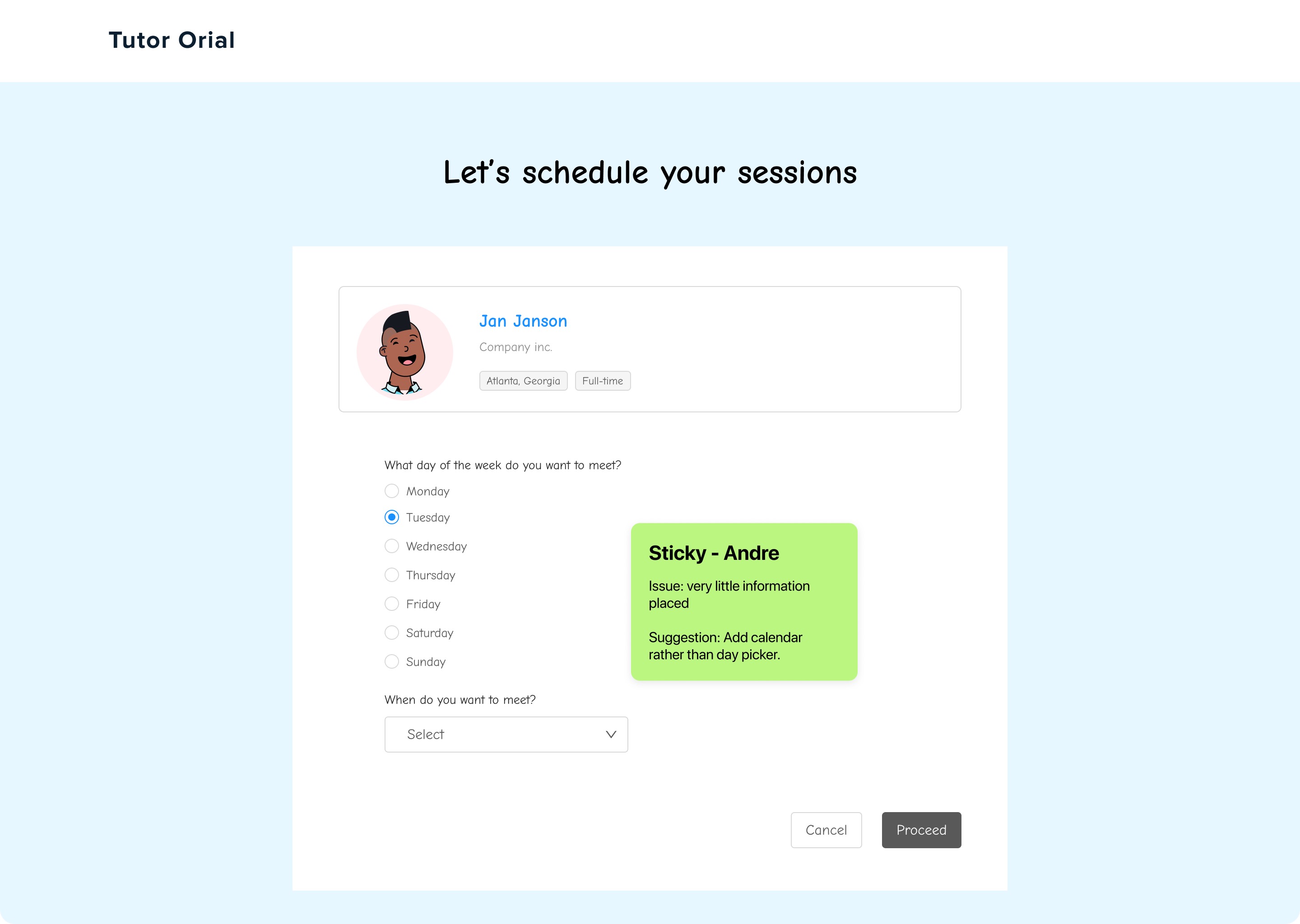
Based on the feedback I received during the interview, I felt it was important to utilize annotations with emojis to better express users' emotions towards a specific action. This approach enabled me to understand and grasp their thoughts and feelings more effectively. Additionally, I created a user emotion journey map based on their feedback, which provided valuable insights into the interviewer's reactions.
scroll to see more
![]()

If the feedback received was positive, I utilized a smiley face emoji to represent it. In instances where constructive criticism was provided, I used a thinking emoji to indicate that there were areas for improvement. Similarly, if the feedback contained helpful and innovative ideas, I employed a light bulb emoji to represent them.
03.Problems & Solutions
After analyzing the feedback, I identified the problems from my lo-fi and mid-fi prototypes and concluded the areas where I need to improve.
PROBLEM
- Branding Identity not strong engouh
- Little information before sign up
- Need to go back and forth to choose tutor and time
- Not attractive enough to place order
SOLUTION
- Bring in illustraions, and keep visual smooth and rounded
- Move the sign up button down below the info on Home Page
- Adding available time slot on individual tutor info page
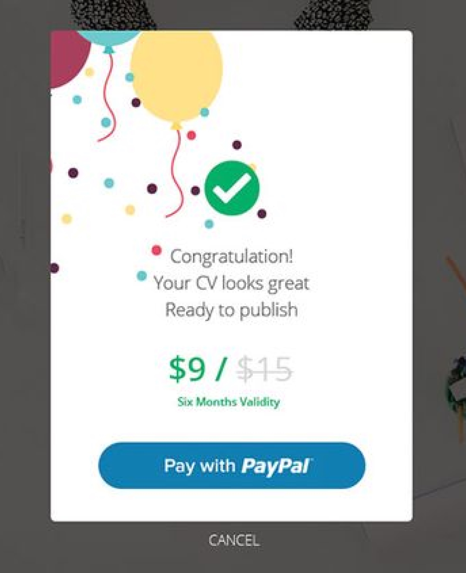
- Including discount/free trial
D.Hi-Fidelity Prototype
I have refined the branding by creating a logo that features the initials 'T' and 'O'. The 'T' is designed to resemble an open book, while the 'O' is in the shape of a magnifying glass. The slogan for the brand is 'One-to-One Tutoring for Every Student'.
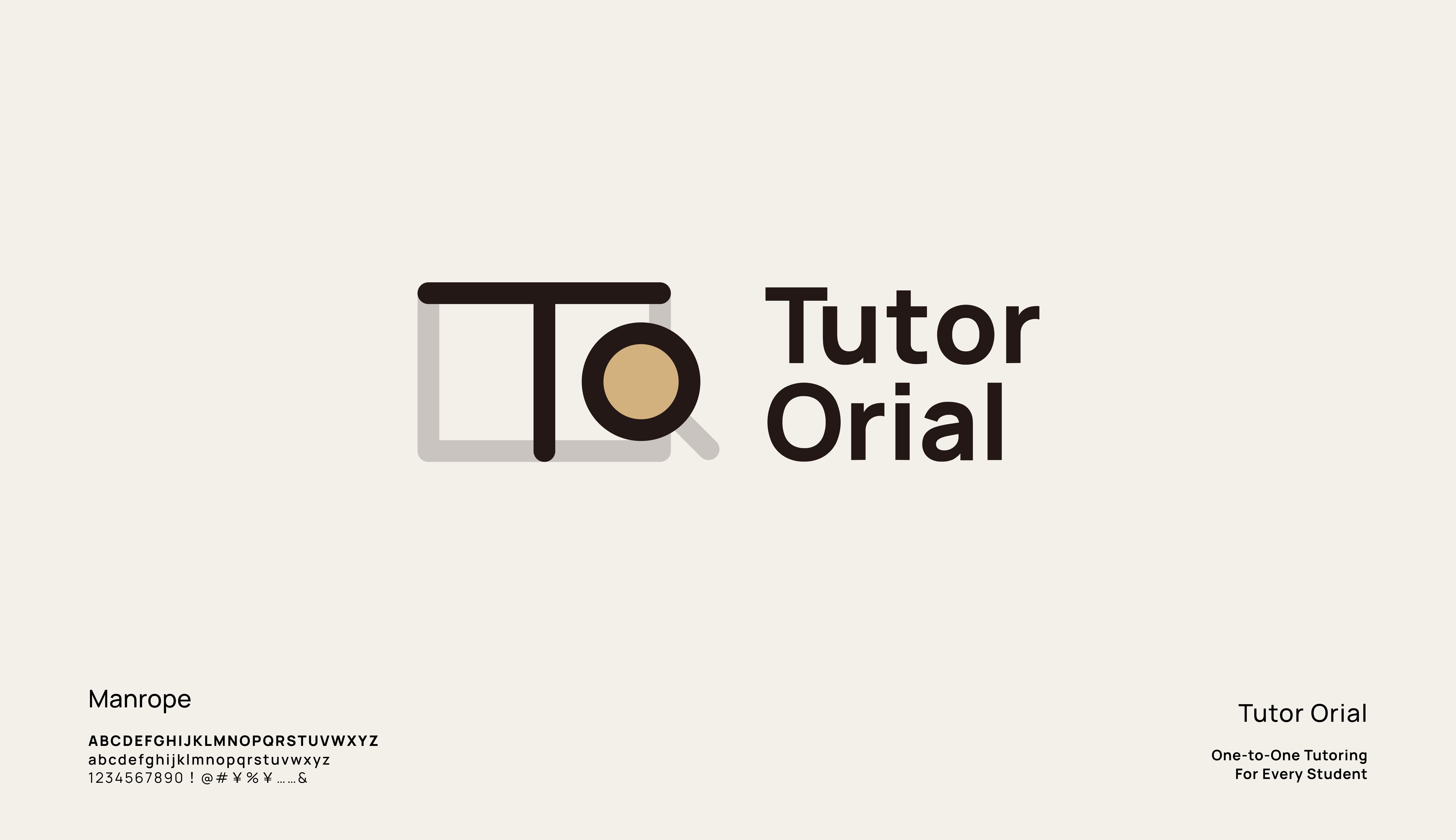
I have developed several combinations of icons and logotypes that feature these elements. The brand colors I have chosen are success gold, white, and black


E.Learning & Next Steps
01.Reflections
I have gained familiarity with the UI/UX project process and have become a lot more proficient in the relevant software. During interviews, I have learned to avoid being defensive and instead focus on listening actively to feedback. Additionally, I have realized the importance of thinking broadly at the beginning of a project in order to avoid narrow solutions and explore a wider range of possibilities.


02.Next Steps
To improve the website, I plan to refine the branding even more, including the use of original illustrations to create a unique visual identity.
I also intend to accentuate the discount offers more prominently on the home page to attract more customers. To ensure a smooth user experience, I would love to conduct more rounds of usability testing to identify and address any issues that may arise.
I also intend to accentuate the discount offers more prominently on the home page to attract more customers. To ensure a smooth user experience, I would love to conduct more rounds of usability testing to identify and address any issues that may arise.
Back to Top